-
8.
- Overview
- Sample
- Data Collection
- Instrument Development
- Data Results
The second experiment conducted was a pilot test to investigate the advantages, difficulties, and question layout of a study involving auditory graphs using the World Wide Web as a testing environment. The logistical difficulties of having large numbers of subjects take a test requiring computer generation of sounds to represent a graph was evident from the Triangle pilot. Also, there was a necessity for a more flexible testing environment, as was also evident from the Triangle pilot. It was suggested to the author that a World Wide Web (web) based test could overcome these difficulties by allowing access to the test by many individuals. [Ceb97] The web would allow for a flexible testing environment as pictures, sound, and text could be easily configured and changed. Multiple graphs could be displayed with little effort.
This experiment, named the Web pilot, utilized a standard browser program, such as Netscape or Internet Explorer, to display the introductory materials, questions, and visual and auditory graphs as a series of web pages to student subjects. The results from this experiment helped to show where revisions needed to be made when testing subjects with this new medium. The Triangle pilot provided the basis material for this experiment, and the Web pilot served as the basis for the main study.
8.As the testing process was designed for first year physics students, instructors of these courses were solicited during the Fall 1997 quarter for the possibility of letting their students participate in this study. It was arranged with one instructor of a Physics 201, introductory algebra based, course at OSU to provide extra credit homework points to students taking Web pilot test. The instructor announced the location of the Web pilot test web page in class and posted a link on the course information page. Student volunteers were given one week to complete the test from the initial announcement.
From this single course, 221 out of about 400 enrolled students completed the Web pilot test. Several other students attempted the test, but due to technical difficulties did not complete all of the questions. Only subjects completing all questions had their data recorded. Of the 221 subjects, 74 subjects received auditory graph, 75 received visual graph, and 72 received both auditory and visual graph presentation methods. These numbers allow for statistically significant results at the p = 0.05 level since n > 62 (from equation 3.2) for each group.
8.Subject volunteers accessed the Web pilot test site from remote computers at various locations at Oregon State University. Data was collected and written to a secure file through the use of several PERL scripting programs to record data from subject responses to questions presented on web pages. These programs can be found in Appendix E. Subjects were also randomly assigned to one of the three display methods by the scripting program.
When subjects accessed the address announced in class, they were presented with a welcoming page stating the purpose of the test, a brief description of auditory graphs, and links to a web page further describing auditory graphs and examples. The welcoming page also contained a copy of the informed consent document.
After the introductory information web page, subjects were presented with a page to record their name and a school class code into text entry form fields. The names, class code, and separate identification (id) code number were appended to a secure file which contained previous subject's names by a PERL script program called namepage. This program also randomly assigned the subject to one of the graph test groupings, labeled b, s, or v, and then passed the id and graph codes to the next web page to be presented.
The use of the id code number was to eliminate results from multiple tries of the test, to have a record of which students from a given class completed the test, and as a method for comparison of results between tests. Subject's names were not written to the web pages for security, anonymity, and coding issues.
The survey web page contained text entry fields as well as radio button type choice fields. A second PERL program, surveyrecord, recorded the subjects id code number and any long text answers to a separate file when subjects chose the "Next page" button. The id code, graph code, and several of the survey answers were passed as a text string to the pretest page. The graph code was also passed as a variable to later pages.
A third PERL program, prerecord, added the pretest page answers to the text string when subjects chose the "Next page" button. This program passed the answer string, along with variables for the graph code and the start time of the test to the next web page. The time that subjects took to answer the test was measured to provide some insight as to how long students took with the different presentational methods. This program generated the first test question page.
A fourth PERL program, temprecord, generated subsequent web pages. The questions were read from individual files, and contained multiple choice, radio button style answer selections. Graph codes, previous answers, and starting time information were written to the generated web page. The graph presentation was determined from the graph code value and incorporated into the page as well. When subjects chose the "Next" button, their answer for the question was added to the answer string and the next question read from a predetermined file. When the last question had been completed, the program calculated the total time, added this information to the answer string, and appended the string to a secure file of previous subject answers.
8.As in the prior experiment, there were three instruments: an initial survey questionnaire, a pre-test, and a main graph test. The content and subject matter of the survey, pre-test, and main test were similar to those of the Triangle pilot, but with the revisions as noted in the previous experiment. The presentation was through a linear series of web pages. Copies of the Web pilot survey, pre-test, and main test can be found in Appendix B. There were three display methods for this study: visually presented graphs, auditory graphs, and both auditory and visual graphs. There was no paper presentation method as in the prior experiment due to the similarity in scores with the visual presentations, and due to logistical difficulties.
The challenge of this experiment was to convert the testing process of the Triangle pilot to a web based format. Methods to display the question text and the visually presented graphs were not difficult as the standard web browser has this ability built into the display. The method of producing an auditory graph that could be played from the browser window was more problematic. The difficulty lies in the ability of computers to produce sound from various audio file formats. One of the most common and useful formats, the Microsoft .wav format leads to large file sizes (on the order of 100 Kb.) The transfer of large files on the web results in long delays for the display of the auditory graphs, especially if the subject is using lower speed modems to access the test. The use of MIDI reduced the auditory graph file sizes to about 2 Kb. producing a page that would download and display more rapidly.
The MIDI protocol uses data streams to trigger stored sound wave patterns on the host computer. Each sound wave represents an instrument, or voice, that is then played with the notes supplied by the data stream. Thus complex sounds can be reduced to small data files. For the Web pilot, y axis data values were represented with a piano voice that varied in pitch.
The disadvantages of the MIDI format are that sounds are not completely consistent from one computer to another, as each may have different stored wave pattern representations corresponding to a given MIDI voice code. Also, there is an inherent limitation on the resolution of sounds since MIDI uses a chromatic scale as a basis for the divisions between notes. To produce sounds between the given notes results in greatly expanding the file size.
As was shown in the Triangle pilot, auditory test subjects had great difficulty distinguishing between linear and curved graphs. One of the Triangle pilot subjects made the suggestion to add tick marks to represent the y axis values. This suggestion was incorporated by the following method.
When the data values passed certain intervals, a tick mark was sounded. The tick mark sound was represented by a drum instrument voice. The resulting frequency, or tempo, of tick marks thus represents the magnitude of the slope, or first derivative, of the graph at a given point. A small magnitude slope resulted in a low frequency, or slow tempo, while a large magnitude slope resulted in a high frequency, or fast tempo. The sign of the slope was easily determined by listening to whether the data value pitch was increasing or decreasing.
While this process provided much needed information, information about the second derivative was also easily incorporated by modifying the pitch of the drum voice. To reduce the auditory load, it was decided to only use three pitches to represent the second derivative, one for negative values, one for positive values, and a third for 0. The optimal choices of pitches is a matter some debate and is the subject of future research.
For this study, it was chosen to represent negative values of the second derivative with a high drum pitch, positive second derivative values had a low pitch, and 0 was represented with a pitch in between the two. Thus, the graph of y = x2, from 0 to 1, would have an increasing piano tone and a low pitch drum that would increase in tempo, and the graph of y = 1 - x2, from 0 to 1, would have a decreasing piano tone and a high pitch drum that would also increase in tempo. The graph of y = x, would have an increasing piano tone with a constant tempo drum beat whose pitch was between the high and low drum pitches.
The reasoning for this pitch choice of the tick marks was that, aside from areas with inflection points, negative curvature occurs at local maxima, while positive curvature occurs at local minima. Thus the tick mark pitch would reinforce the data pitch in those areas.
The auditory graphs that were used in this study were produced in a multi-step process. The x, y data sets that were used to create the graphs in the Triangle pilot were converted by the DataSonify program into an SLG formatted text file. This format is an instruction set that the MIDIGraphy program [Ton99] can import and convert to MIDI. DataSonify set the instrument, time duration of the notes, length of the play time of the data set, and calculated and set the drum tick mark derivative information. The MIDI file was converted into the .wav format with SoundMachine [Sou99], and converted into Apple computer's QuickTime format with the MoviePlayer program.
The QuickTime sound file format was chosen as it allowed for a web browser plug-in module that displayed play and pause controls that could be embedded into the web page display. Also, since this module was available for several computer platforms, subjects would have little difficulty locating a computer from which to take the test. To provide alternate access to the sound files, links were included to download the MIDI formatted file, or the much larger .wav formatted file.
The visually presented graphs were produced with the KaleidaGraph program from Synergy Software, and converted to a .gif file format.
8.The following table is a summary of the full results contained in Appendix B. The table is divided by results from the different test groups.
Table .1 Percent Correct per Question for Each Group
|
% correct per Group |
|||
|
Question |
Vision |
Both |
Sound |
|
Pretest |
|||
|
P1 |
77% |
71% |
78% |
|
P2 |
97% |
97% |
96% |
|
P3 |
99% |
96% |
95% |
|
P4 |
83% |
78% |
81% |
|
P5 |
71% |
58% |
73% |
|
Main Test |
|||
|
M1 |
68% |
58% |
30% |
|
M2 |
67% |
65% |
36% |
|
M3 |
59% |
53% |
22% |
|
M4 |
71% |
75% |
57% |
|
M5 |
11% |
10% |
16% |
|
M6 |
68% |
65% |
23% |
|
M7 |
81% |
71% |
64% |
|
M8 |
84% |
89% |
73% |
|
M9 |
69% |
74% |
54% |
|
M10 |
69% |
71% |
41% |
|
M11 |
71% |
81% |
41% |
|
M12 |
71% |
81% |
41% |
|
M13 |
67% |
69% |
42% |
|
M14 |
67% |
69% |
31% |
While the summary table provide an accurate listing of the data, it is helpful to view the same data as a bar chart to recognize patterns in the data and to easily see where any difficulties may lie. The following chart displays the percent correct scores of each test group vs. the individual test questions.
Figure .1 Histogram of the Results of Table 8.1: A Comparison of Correct Answers per Group.
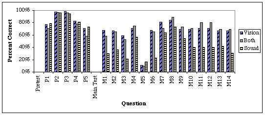
It is fairly evident from the displayed results that the Sound group performed at a lower level than did the Vision and Both groups. Also, it is fairly clear that all subjects had difficulty with question 5 of the main test as the response rate is that of random guessing on a five choice question.
8.Analysis of the pre-test is displayed in Table 8.2 This is the results for a double tailed t-test at the a = 0.05 level between the Sound and Vision groups, and between the Both and Vision groups.
Table .2 Pre-test t-test Analysis
|
Two tailed t-test |
|||||
|
Group |
mean |
variance |
df |
t |
t critical |
|
Sound |
4.23 |
0.92 |
147 |
-0.24 |
1.98 |
|
Vision |
4.27 |
0.79 |
|||
|
Both |
4.00 |
0.96 |
145 |
-1.73 |
1.98 |
|
Vision |
4.27 |
0.79 |
|||
Since |t| < tcritical in both cases, there are no significant differences between the groupings. ANOVA of all three groups also showed no significant differences. Since F = 1.65 < Fcritical = 3.04, the hypothesis that the three groups are equivalent is not rejected. Thus, the three groups can be considered identical.
Analysis of the Main test produces a different result however. In this case, ANOVA produces F = 32.03 > Fcritical = 3.04, and the equality hypothesis is rejected. F and t-test results for the comparison at a = 0.05 between groups is given in Table 8.3.
Table .3 Main test data analysis
|
F-test between groups |
||||||
|
Group |
Mean |
Variance |
df |
F |
F Critical, one-tail |
P (F<=f) |
|
Sound |
5.65 |
8.48 |
73 |
0.82 |
0.68 |
0.80 |
|
Vision |
9.29 |
10.32 |
74 |
|||
|
Both |
9.18 |
10.63 |
71 |
1.03 |
1.47 |
0.45 |
|
Vision |
9.29 |
10.32 |
74 |
|||
|
Both |
9.18 |
10.63 |
71 |
1.25 |
0.17 |
1.48 |
|
Sound |
5.65 |
8.48 |
73 |
|||
|
Two tailed t-test between groups |
||||||
|
Group |
Mean |
Variance |
df |
t |
t Critical |
P (T<=t) |
|
Sound |
5.65 |
8.48 |
73 |
-8.13 |
1.99 |
0.00 |
|
Vision |
9.28 |
10.45 |
||||
|
Both |
9.18 |
10.63 |
145 |
-0.21 |
1.98 |
0.83 |
|
Vision |
9.29 |
10.32 |
||||
|
Both |
9.18 |
10.63 |
144 |
6.91 |
1.98 |
0.00 |
|
Sound |
5.65 |
8.48 |
||||
In the Sound vs. Vision, comparisons, F = 0.83 > Fcritical = 0.68, and |t| = 8.13 > tcritical = 1.99. In the Both vs. Sound, comparisons, F = 1.25 > Fcritical = 0.17, and |t| = 6.91 > tcritical = 1.99. These results indicate that there is a significant difference between the Sound group and the other two groups. In the Both vs. Vision comparisons, F = 1.03 < Fcritical = 1.47, and |t| = 0.21 < tcritical = 1.98. These results indicate that there is no significant difference between these two groups. Thus, the 25% difference in performance between the Sound group and the others is a significant effect.
It is interesting to note that the Sound group took 1.8 minutes longer to answer the 14 questions of the test than did the Both group. This averages out to about 8 seconds more per question. Since both of these groups would have similar times for download and display of the graphs, the extra time may indicate the extra time for understanding the graph when there is no visual cue. Although, this may also indicate that, on average, the Both group did not play one of the graphs.
There were eight questions where the Sound group faired particularly poorly in comparison to the other groups. The difference in average percentage of correct responses for questions 1, 2, and 3 was 38, 30, and 37% respectively. This might be attributable to unfamiliarity and lack of training with the display format. If subjects did not follow the optional links on the introductory page, the auditory format may have caused some confusion.
Question 6 had the largest difference of 45%. It displayed a complicated, segmented graph of an object's motion and asked subjects to find the minimum. The large difference in performance may again be an effect of lack of training, or an indication that this was a particularly poor question for auditory graphs.
Questions 11 and 12 involved composite graphs with linear and curved sections and each had a differences of 30%. The sound group may have had difficulty with these questions due to the difficulty representing the value y = 0 with sound.
Questions 10 (29%) and 14 (36%) involved curved graphs where the Sound group may have again been hindered by lack of training and thus found these graphs confusing.
Several questions show that the auditory format has at least some promise, even when subjects have had virtually no training. Questions 4, and 7 involved linear graphs and had differences of only 14% and 18%. While not perfect, this may still indicate that the auditory format can be used even with very limited examples and training.
Questions 9 and 13 were both graphs of x2, but had differences of 15% and 25%. The sound group tended to perform somewhat better with these curved graphs than with the others, but the 10% range is troublesome.
Table .4 Split Half Analysis of Differences Between S and V groups for Web pilot.
|
Question |
% Correct |
Split Question |
% Correct |
|
1 |
38 |
4 |
14 |
|
2 |
30 |
7 |
18 |
|
3 |
37 |
6 |
45 |
|
5 |
-6 |
8 |
11 |
|
9 |
15 |
13 |
25 |
|
10 |
29 |
14 |
36 |
|
11 |
30 |
12 |
30 |
Split half analysis on the difference between the Sound and Vision groups gives a correlation r = 0.49 which shows some consistency between the questions but also shows the effects of the wildly varying performances.
8.It was strikingly apparent from this pilot study that using the World Wide Web as a testing environment had enormous advantages. An automated display and recording system was able to provide similar results that over 100 hours of guided interviews would have produced, not to mention eliminating scheduling conflicts and providing reasonable participation. Over half of the enrolled students in the course where the test was offered for extra credit participated, even though only about a quarter of the class was in attendance the day the test was announced.
Several subjects e-mailed comments about how interesting and enjoyable the auditory test was. The web based testing method also eliminated any effects of pressure due to the proximity of an investigator as well as allowing for an unlimited time to complete the test. While this method produced many good results with relatively few problems, the method was not perfect. Approximately 10% of the subjects attempting the test either were not able to complete it, or had to try multiple times due to technical difficulties.
From the results showing an average of a 25% difference in correct response rates between the Sound and Visual groups, it is evident that the auditory graphs used in this test were not as effective as visually displayed graphs. One possibility is that difference was caused by the lack of a proper introduction to the new graphing technique. Since subjects were not forced to understand the auditory graphs before starting the test, they may have found the graphs confusing.
This problem was corrected in the Main Auditory Graph test discussed next. It should be noted however, that had the auditory graph group simply been guessing, their correct response rate would have been about 20% instead of 41%, thus subjects were able to use these graphs to a limited extent even without training.
It was also evident from this pilot test that there were too few questions to provide a useful comparison between subject performance on linear, curved, and more complex graph patterns. Also, it was not clear from these questions how well the subjects were able to understand the shape of the graph versus their ability to draw conclusions from the graphs. Therefore, the Main Auditory Graph test used an expanded set of questions, including separate sections devoted to math or physics based graphs.