-
7.
- Overview
- Sample
- Data Collection
The first experiment conducted was a pilot test to investigate the advantages, difficulties, and question layout of a study involving auditory graphs. This experiment, named the Triangle pilot, utilized the TRIANGLE program to display the questions, visual and auditory graphs to a majority of the subjects. While the results from this experiment helped elucidate several inadequacies in the production and testing of the auditory graphs, they also showed that there were no serious difficulties with this representational method technique. The Triangle pilot provided the basis material that was used in later studies.
This experiment consisted of three instruments: an initial survey questionnaire, a pre-test, and a main graph test. The purpose of the questionnaire was to provide basic demographic and other relevant information to aid in analysis of the responses. The pre-test consisted of five questions to check subject understanding of basic graph concepts. The pre-test was given in a printed form, and consisted of labeled graphs that subjects could easily identify. The main test consisted of 14 multiple choice questions. Additionally, there were fill-in-the-blank supplements for two of the multiple choice questions. The questions were designed to be equally valid for either visual or sonified displays. Copies of the survey, pre-test, and main Triangle pilot test can be found in Appendix A.
Subject matter for the questions centered on previously published research involving graphs and physics. Most notably, a few questions from the Force Concept Inventory (FCI) [Hes92a], Mechanics Baseline [Hes92b] tests, and questions found in the Beichner [Bei94] study were used after some modifications. Other questions were developed after an analysis of subject matter presented in several introductory physics text books. The final questions were reviewed for content validity by several physics and science education faculty at Oregon State University.
There were four treatment methods for this study: graphs visually presented on paper, graphs visually presented on the computer, auditory graphs presented on the computer, and both auditory and visual graphs presented on the computer. The paper presentation method was to check for any novelty effects that the Triangle program might introduce. The presentation method with both sound and picture graphs was to check for any increase due to multi-modal presentation.
7.Ideally, a random sampling from a wide variety of first year physics students would be desirable. However, this was not possible for the scope of the pilot study. It was decided to limit participation to local students. As the testing process was designed for first year physics students, instructors of these courses were solicited for the possibility of letting their students participate in this study.
It was arranged with one professor to solicit students taking the laboratory component of the 1997 summer session of Physics 201, which was an introductory algebra based physics course. Subjects participated in the study during the same time as their normally assigned laboratory section. For their participation, students received full credit for the missed class. Names of volunteers were taken from each of three laboratory sections that met on the same day, with a total of 43 students volunteering.
Due to time constraints and resources, the study limited the focus to twelve students. This was in part due to the number of students who could be tested during the three two hour laboratory sections on a single day. The time for completion of the questions for the test was estimated to be half an hour as this was approximately the time taken by graduate student volunteers on a previous day. A list was formed of the volunteers and a computer randomly selected four subjects from each laboratory section for a total of 12 subjects. The chosen student volunteers were taken from their next lab session and asked to come to a designated room at 1/2 hour intervals.
7.Data was collected through a guided interview process. The interviewer served as a guide to answer general questions, such as from ambiguous wording or instructions, and set up the questions and graphs on the computer. This last step was necessary as the TRIANGLE program was not designed as a testing environment. Randomly chosen student subject volunteers met with the interviewer at an appointed time and place. They were given an informed consent document to agree to, then given the survey and pre-test to answer. Subjects were randomly assigned to one of the four graph category groups (three subjects per group): visual graphs printed on paper (Print group), visual graphs displayed on the computer (Visual group), auditory graphs produced by the computer (Sound group), or both visual and auditory computer graphs (Both group). Subjects were shown each of the questions on the computer, except for the print group who had questions on paper, and given as much time as they wanted to answer the question before proceeding to the next question. Subjects' answers were recorded on a separate, prepared page.
The testing area consisted of a room with a large table upon which a computer was placed, and several chairs at the table. A video camera recorded the sessions, and all subjects had been questioned and gave their consent to being video taped; the subjects where shown where the camera was located. Upon entering the room each subject recorded their name on a log page and was given a Document of Informed Consent (Appendix A) to read and sign. They were next presented with the Survey page, with the Pre-Test located on the reverse side. After completing the initial questions, the subjects were given an answer sheet to record their responses. The survey and answer sheets were marked with a code to identify which student and type of test they took.
For the main test, each subject was given one of four formats of the test. The order of the type of test to be given was changed between groups of students and is listed in Table 7.1 where P represents the test given on paper, V for the test displayed on the computer (visual), S for the sonification of the graphs, and B for the test where both sound and computer visual display were used.
Table .1 Test type per interview time.
|
Student : |
1 |
2 |
3 |
4 |
|
Group 1: 10-12 am |
S |
V |
B |
P |
|
Group 2: 1-3 pm |
B |
V |
P |
S |
|
Group 3: 6-8 pm |
P |
S |
V |
B |
In cases where the computer was utilized (S, V, and B groups) the investigator changed the computer display between each question. In the studies with sound, subjects had control of the graph playback via the computer’s keyboard. Subjects were allowed as much time as they wanted to study and listen to the graphs and to answer the questions. Subjects were also allowed to return to previous questions if they wanted to change their answers.
The interview process was videotaped for later study, most notably to check for leading by the interviewer. All materials used in this study were submitted to the OSU Institutional Review Board (IRB) for exempt review and approval. After receiving endorsement by the IRB, subjects were solicited for participation in the study. Two graduate students participated using auditory graphs for purposes of reliability testing, and for estimation of the time to be allotted for scheduling purposes.
7.Subjects were initially presented with a survey to provide some demographic information to aid in later data analysis. Development of the study began with a comparison of those used in other studies and an analysis of what items may be most relevant to this study. An initial survey question list was developed and reviewed by several physics and science education instructors and professors known for their interest and excellence in teaching at Oregon State University. Suggestions were then reflected upon and incorporated into the final survey.
The pre-test consisted of five multiple-choice questions about two graphs. These questions were developed to be similar to the type of questions that the subjects would find in the main test. The pre-test was a printed page and thus allowed for labeling of graph axes. The pre-test had the same review process as the survey questions.
Questions for the main graph test for the study proved to be a challenge to create. The primary difficulty was to find questions that could be applicable both in a visual sense as well as a sonified data set. The sonification technique was provided by the TRIANGLE program. This is a DOS based program developed by the Science Access Project at OSU which has the ability to take a column of data from a table and to create a graph from the data.
This program also has a text region where the questions can be displayed, as well as a display for graphs which can be generated from a table of data points and then plotted on the screen. While viewing the graph, a user can also listen to a sound representation (sonification) of that graph. In the case of the TRIANGLE program, sonification of the data was represented with a linear relationship of pitch to the y-axis data values, while the x-axis values were converted to time and stereo location. The resulting auditory graphs could be played either continuously, or by stepping through data points with keys on the computer's keyboard. Subjects in the test groups that utilized sound graphs were given a brief description of the auditory graphs but no training. Screen images of the TRIANGLE display can be found in Appendix A.
To provide testing situations for the different graph presentation methods which were as nearly identical to each other as possible, the information contained in each of the graphs, and the question wording, was as equivalent as possible so that the only dissimilarity was the mode of input. For example, title and axis representation were mentioned explicitly in each question, rather than on the graph's axes as the auditory graphs had no labeling method. Each graph was also displayed separately from the question text, although this was partially an aspect of the program used to display the graphs.
It was decided that only simple graphical information should be portrayed in the questions as there have not been previous studies determining the effectiveness of interpretation of auditory graphs. The restrictions placed on the development of questions and investigation of introductory texts and previous studies provided material for 14 questions. These questions underwent review by graduate physics students, professors in physics and science education at OSU.
The wording of the individual questions was designed to provide correct and clear distinction between choices with an emphasis on drawing conclusions from the information displayed in the graphs and not primarily on their background knowledge of physics. Two short answer questions were included to probe their understanding of more complex physical issues (11b, and 12b) but these were not the primary focus of the test. Answers to the multiple-choice questions were evenly distributed among the five choices (A, B, C, D, and E.) The answer sheet was developed to provide a consistent method for the subjects to record their answers. There was space provided on the answer sheet for the subjects to write any additional comments about wording of the question or other information that the interviewer might find useful. A copy of the answer sheet is also found in Appendix A.
To check reliability, the test questions were constructed to be applicable for split-half analysis. Table 7.2 displays the correspondence between the graph type and the question number. Test splitting was for similar graph type rather than for questions concerning similar physical phenomenon.
Table .2: Distribution of Graph Types
|
Graph Type |
Question Numbers |
|
Linear: Constant |
1, 4 |
|
Linear: Increasing |
2, 7 |
|
Linear: Decreasing |
5, 8 |
|
Segmented: Linear |
3, 6 |
|
Segmented: 1/x2 |
11, 12 |
|
Nonlinear: x2 |
9, 13 |
|
Nonlinear: Root, 1/x |
10, 14 |
Generation of the graphs used in the pre-test and the main test followed a multi-step process. First the physics principle investigated was modeled by an equation or segmented graph. A small program was developed to aid in creating a table of numbers that represents the desired graphs. Each graph had 100 data points, as the TRIANGLE program could create a sonified graph lasting approximately three seconds with that many data points. The program that generated the data was called Data Maker and sample output can be found in Appendix A. The table of values that was generated was then imported into Microsoft Excel for collation into a larger table, having one column of data point per question. The resulting table was converted into a format for use by the TRIANGLE program. Each column of numbers was plotted at the time that the corresponding question was asked.
The necessity of using an interview process arose from the difficulty in learning and utilizing the TRIANGLE program to display questions and graphs. While the auditory display was straightforward to use once the data had been loaded, the process of loading and manipulating the data could have interfered with the interpretation of the graph. Thus, the interviewer was responsible for displaying the data so that the subjects needed only be concerned with interpretations derived from the display methods.
7.Table 7.3 is a summary of the results contained in Appendix A. The table is divided by results from the different test groups.
Table .3 Percent of subjects answering given questions correctly.
|
% Correct |
|||||
|
Question |
|
Visual |
Both |
Sound |
Grad |
|
Pretest: |
|||||
|
Q10 |
100% |
100% |
100% |
100% |
100% |
|
Q11 |
100% |
100% |
100% |
100% |
100% |
|
Q12 |
100% |
100% |
100% |
67% |
100% |
|
Q 13 |
67% |
100% |
100% |
67% |
100% |
|
Q 14 |
0% |
33% |
0% |
100% |
100% |
|
Average |
73% |
87% |
80% |
87% |
|
|
Main Test |
|||||
|
Q 1 |
67% |
67% |
0% |
0% |
100% |
|
Q 2 |
33% |
33% |
33% |
0% |
100% |
|
Q 3 |
0% |
33% |
0% |
0% |
100% |
|
Q 4 |
0% |
67% |
100% |
67% |
100% |
|
Q 5 |
0% |
33% |
0% |
33% |
100% |
|
Q 6 |
33% |
67% |
67% |
67% |
100% |
|
Q 7 |
67% |
100% |
100% |
33% |
100% |
|
Q 8 |
67% |
100% |
100% |
100% |
100% |
|
Q 9 |
100% |
100% |
100% |
33% |
50% |
|
Q 10 |
67% |
67% |
33% |
0% |
100% |
|
Q 11 |
100% |
67% |
67% |
67% |
100% |
|
Q 12 |
67% |
100% |
67% |
67% |
100% |
|
Q 13 |
100% |
33% |
67% |
0% |
100% |
|
Q 14 |
100% |
67% |
67% |
0% |
50% |
|
Average: |
57% |
67% |
57% |
33% |
While the summary table provide an accurate listing of the data, it is helpful to view the same data as a bar chart to recognize patterns in the data and to easily see where any difficulties may lie. The following chart displays the percent correct scores of each test group vs. the individual test questions.
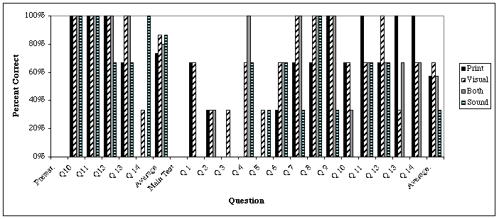
The small number of subjects in each of the four groups is far below the required number to produce valid statistical analysis. However, keeping in mind that errors are greatly exaggerated, there are still a significant number of conclusions that can be drawn from the pilot test. The first point to be noted is the striking difficulty the auditory graph test group had with questions the main test questions 1, 2, 3, 10, 13, and 14. Each of these questions will be reviewed, but the large number of questions that had very poor scores give an early indication that there may have been an oversight in the method of auditory graph production that was utilized.
The mean score on the main test for the undergraduate respondents was 53% answering correctly. While this may seem like a satisfactory value as it is in the center of the distribution, the standard deviation was a very large 25%. This large standard deviation may be attributable in part to poor wording of the questions, lack of knowledge by the respondents, or inadequate use of sonification for the graphs. These issues will be explored later.
Table .4 Split Half Analysis of Test Questions
|
Question |
% Correct |
Split Question |
% Correct |
|
1 |
33 |
4 |
58 |
|
2 |
25 |
7 |
75 |
|
3 |
8 |
6 |
58 |
|
5 |
17 |
8 |
92 |
|
9 |
75 |
13 |
50 |
|
10 |
42 |
14 |
58 |
|
11 |
75 |
12 |
75 |
To further comment on the validity of the test questions in general, analysis of the question types is desired. Split-half analysis to check the reliability of problems of similar graph types generally shows a disappointing relationship. Only for questions 11 and 12 are the percentage of correct responses equal. However, if some leeway is granted, and one standard deviation between answer scores is used then question pairs 1, 4; 10, 14; and 9, 13 would also show validity.
Question pairs 2, 7; 3, 6; and 5, 8 indicate strong deficiencies in either their application or wording as the percentage of correct responses of these questions vary widely. The correlation between the two groupings is r = -0.28, which is very poor, indicating that either the question wording is ambiguous and needs to be rewritten, or that similar graph types do not lead to similar response rates and the question's material is playing a greater role in the test subject's understanding than is the graph.
Graduate student responses for two of the questions ( 9, 13, and 14) were not at 100%. These questions or their auditory representations are highly suspect as not being valid.
7.The following is a commentary on the answers arising from the Survey portion of the pilot test. The survey consisted of nine questions, and were a combination of multiple choice and short answer questions. While the results of this survey were not used for analysis purposes due to the small number of subjects, it was instructive to find where ambiguities lay for later experiments. Questions for the survey and pretest were numbered consecutively, with question 10 being the first pretest question.
Survey questions 1, 2 and 3 concerned general demographics of gender, age and high school physics experience.
There was some confusion with question 4: Number of years of college level physics? by the first year students who took the test. They often asked if they should circle the 0 (because they hadn’t completed a year yet) or 1 (as they were currently taking a first year course.) This difficulty was corrected in later tests by restating the question as: How many courses of college level physics have you completed?
Survey questions 5 and 6 asked subjects to state courses that they felt had been helpful in understanding graphical information. Responses often only stated course numbers which was difficult to decipher. These questions were rewritten for later studies.
Survey question 7: Have you learned graphing techniques other than from academic settings? Was ambiguous to a large number of subjects as they expressed confusion as to what the question meant. During the pilot test, subjects were given examples as to what type of answer was being sought.
There did not seem to be any difficulties with questions 8 or 9 which related to musical training or physical difficulties.
The Pretest questions were rather interesting in that it was expected that questions 10 to 13 would be answered correctly by everyone as they were designed to test the ability of the subjects to simply read a graph and locate points. Three of 14 subjects missed one of the questions , and one missed two. This leads one to conclude that there may be a 9% error rate due to students misreading, or simply not being careful, with the questions.
Question 14 on the pretest was designed to be similar to one of the moderately difficult graphs in that it was a nonlinear graph referring to more complex motion. The number of correct responses was dramatically lower, 33%. This question has content validity as the graduate students had a 100% correct response. It should be noted that all but one of the subjects who had correctly responded to this question were randomly assigned to the sonified graph test group.
The text and answer choices for the questions in the Main Test tend to be more complex. A full listing can be found in Appendix A, so only a brief description of the graph or changes to be made to the questions is described below. A listing of the percentage of correct responses per group is provided for each question. The categories are the total results for the undergraduate test subjects (Total), the printed test group (Print), the group that only saw the test and graph displayed on the computer screen (Vision), the group that both saw and heard the graphs (Both), the group that only heard the sound graphs (Sound), and the graduate student subjects (Grad.) for validity comparison.
An important point to be stressed with these results is that as the undergraduate subjects were divided into four groups, so that each group only had three test subjects; there were only two graduate student subjects. Statistical fluctuations could account for many irregularities in the results as one incorrect response would manifest in a change of 33% for any given group’s correct response rate for a question. Also, there is the reading error as noted in the pretest results. A larger number of test subjects reduces the ambiguity, and is the subject of the web based pilot test.
Main Test Question 1:
|
Group |
Total |
|
Vision |
Both |
Sound |
Grad. |
|
% Correct |
33 |
67 |
67 |
0 |
0 |
100 |
This was one of the more surprising results. The graph was designed to be the easiest to recognize, a straight flat line, and the axes common (distance, time) yet most students were not able to answer this question correctly. However, subjects who saw the graph on the printed page or on the computer screen had equivalent results whereas the subjects who heard the graph or heard and saw the graph all missed this question. The difference, especially for the Both group could be attributable to a novelty effect of hearing the sound display and unfamiliarity with what the display was representing.
The sonified graph in this case was a constant tone; a training period for the sound graphs seems to be necessary for less experienced students, especially when considering the results from the next two questions. It was noted that answer A) The object is moving with a constant non-zero acceleration. and C) The object is moving with a uniformly increasing velocity. are the same. The second answer should be changed to C) The object is moving with a uniformly decreasing velocity. as it was in the pretest.
Question 2:
|
Group |
Total |
|
Vision |
Both |
Sound |
Grad. |
|
% Correct |
25 |
33 |
33 |
33 |
0 |
100 |
This question was again intended to be fairly straightforward. The Grad. response shows that experienced graph readers can understand this question. The equality between Print, Vision, and Both groups shows that displaying the graphs on the computer may not be a significant effect. The low score for Sound, may be from random variations, or as a result of unfamiliarity with the sound graph representation. The same change should be made to answer C for the same reason as in question 1.
Question 3:
|
Group |
Total |
|
Vision |
Both |
Sound |
Grad. |
|
% Correct |
8 |
0 |
33 |
0 |
0 |
100 |
The results of this question were particularly interesting as this question was modeled on a similar question used in the study by Beichner. [Bei94] In that study, there was a 33% correct response rate whereas this pilot test had an 8% rate. Again, the Sound group completely missed this question, this may not be as significant as it first appears as the other groups also did very poorly. It is possible that the entire question should be rewritten, however the Grad. subjects found the question legitimate. Answer B) The object doesn’t move at first. Then it rolls down a hill and finally stops. may have caused some confusion as it could possibly be construed as correct. A change to B) The object doesn’t move at first, then it moves away from the reference point, and finally stops. may correct any misunderstanding.
Question 4:
|
Group |
Total |
|
Vision |
Both |
Sound |
Grad. |
|
% Correct |
58 |
0 |
67 |
100 |
67 |
100 |
This question gives some indication that the sound graphs may be a valid form of data representation as the sound Score is as high as Vision, and Both was even higher. However, the dramatic difference between Print and Vision scores may indicate that random fluctuations are greater than the one standard deviation previously mentioned. This question was designed to be a compliment to question 1, and the Vision group did have the same score. Groups using sound had improved scores, perhaps indicating that a training period had taken place. Answer C should probably be modified as in Question 1.
Question 5:
|
Group |
Total |
|
Vision |
Both |
Sound |
Grad. |
|
% Correct |
17 |
0 |
33 |
0 |
33 |
100 |
The generally poor results on this question can be attributed to the wording of the answers, which while correct, were meant to distinguish between subjects who had a good understanding of the concept of acceleration. Subjects only chose one of two answers: A) The object is moving with a constant acceleration. and B) The object is moving with a decreasing acceleration. The graph showed a linearly decreasing velocity, hence an constant, albeit negative, acceleration. Experienced subjects did not have difficulty with this question.
Question 6:
|
Group |
Total |
|
Vision |
Both |
Sound |
Grad. |
|
% Correct |
58 |
33 |
67 |
67 |
67 |
100 |
Subjects faired generally well on this question which had one of the most complex graphs. This question paralleled one of the pretest questions. As can be seen, the Sound groups did at least as well as the other groups.
Question 7:
|
Group |
Total |
|
Vision |
Both |
Sound |
Grad. |
|
% Correct |
75 |
67 |
100 |
100 |
33 |
100 |
It is not understood why the Sound group did considerably worse on this question than the other groups, except that this question is the same graph type as question 2 and the results were also poor on that question. There could be a difficulty in recognizing the pitch, and hence the y value, as being a linear increase.
Question 8:
|
Group |
Total |
|
Vision |
Both |
Sound |
Grad. |
|
% Correct |
92 |
67 |
100 |
100 |
100 |
100 |
Questions 7 and 8 are related in the physics principle that is questioned, hence the similarity in the majority of the scores. The Sound group shows a dramatic change, which while this could be attributed to statistical fluctuations, could also be the result that perhaps the linearity or curvature of graphs starting with a high pitch and ending with a low pitch may be more easily distinguished than in those that start low and end high.
Question 9:
|
Group |
Total |
|
Vision |
Both |
Sound |
Grad. |
|
% Correct |
75 |
100 |
100 |
100 |
33 |
50 |
This question gives a clear indication that curved graphs are not well perceived in this form of data sonification. Not only did the Sound group do poorly, but the Graduate subjects noted that they could not tell the correct answer from the sound graph and either mentioned that they knew what the one correct answer was, but answered according to what they heard, or simply relied on prior knowledge.
Question 10:
|
Group |
Total |
|
Vision |
Both |
Sound |
Grad. |
|
% Correct |
42 |
67 |
67 |
33 |
0 |
100 |
This is interesting in that subjects either chose one of three answers: the correct response of 1/wavelength, the incorrect response of decreasing linearly with wavelength, or not related to wavelength. The second answer may have been the result of a confusion on the wording; perhaps this answer should be rephrased to B) The frequency has a constant, linear decrease as the frequency increases. While the question appears to be generally valid, the low scores of both groups utilizing sound indicates that a better sonification technique is necessary for less experienced students.
Question 11:
|
Group |
Total |
|
Vision |
Both |
Sound |
Grad. |
|
% Correct |
75 |
100 |
67 |
67 |
67 |
100 |
Question 12:
|
Group |
Total |
|
Vision |
Both |
Sound |
Grad. |
|
% Correct |
75 |
67 |
100 |
67 |
67 |
100 |
Subjects did well on these two similar questions. These questions involved graphs which were more complex. Answers tended to be between those which were most similarly related tot he graphs, perhaps indicating that better distracters need to be constructed. The Sound group performed as well as the other groups on these questions, indicating that more complex auditory graphs can be used.
There were second parts to these questions, 11b and 12b. What does the peak on this graph represent? , the answers tended to be statements of the graph, rather than its physical interpretation, indicating poor question wording. This type of questioning was dropped in later experiments.
Question 13:
|
Group |
Total |
|
Vision |
Both |
Sound |
Grad. |
|
% Correct |
50 |
100 |
33 |
67 |
0 |
0 |
The large difference in scores between the Print and Vision groups may be due to random fluctuations. Again, the Sound group shows that this sonification method was not adequate for curved graphs, and the Grad. results also back this statement.
Question 14:
|
Group |
Total |
|
Vision |
Both |
Sound |
Grad. |
||
|
% Correct |
58 |
100 |
67 |
67 |
0 |
50 |
||
Again, here the problem seems to be not in the question, but in the sonification of the graph which results in perhaps the clearest indication that the method of sonification used in the Triangle pilot was not useful for simple curved graphs.
7.The guided interview process for the test was only be necessary to answer questions about the test and to set up the computer between each problem. It was noted by one subject that the proximity of the interviewer was uncomfortable in a performance setting. The proximity issue was immediately resolved, but question set-up became more time consuming. The Web Pilot test removed this issue by allowing for a self running testing environment which could be accessed from remote locations and did not require the intervention of an experienced user.
The length of time that subjects spent taking the test was as anticipated. The assumed time to complete all test parts was about 30 minutes , or about a problem a minute. This was a reasonable guess as many of the problems were conceptual, multiple choice questions which did not involve calculations. Subjects in the Print group tended to finish the Main test in less time than did the others due to not having to wait for the investigator to reset the computer for the next problem.
While a cursory review of the data shows that the Sound group performed substantially below the level of the other groups, this problem may be able to be overcome. First, looking at the questions where the Sound group performed as well as the others and comparing the question types to those where they did not perform well provides important clues as to better sonification methods. It appears that subjects were able to easily distinguish absolute values by sound (i.e. pitch being higher or lower) and essentially what is the first derivative of the function (is it increasing or decreasing) but not, the second derivative (the rate at which a function is increasing or decreasing.) This is shown from the poor results on any of the graphs portraying curved functions. The more experienced subjects (graduate students) were able to interpret the shape of the graph from the more limited information. This came about because they immediately converted the sound into a picture. Even with this experience, they still had difficulty interpreting graphs which had a positive curvature.
A solution to this problem was to make the second derivative more pronounced. One way to do this is to add a secondary sonification if the second derivative. This representation may take the form of a series of clicking noises, where the rate represents the second derivative, or how often the curve crosses some y axis interval.
While the Print group was useful for comparison, and a slight difference in the scores was noticed, the difference did not seem to be significant. This result indicates that this fourth grouping may not be necessary, thus allowing for remote computer administration to be more easily accomplished. With fewer testing sections, the group sizes will be larger for a given number of subjects, producing results with greater confidence limits.
Lastly, it is fairly evident that the original hypothesis of the equivalency between simple graphs produced with Triangle's basic sonification technique and those made by traditional, visual graphics, with this testing method was not realized for a significant part of this test. One significant factor is the lack of training that subjects in the Sound groups encountered before the test. While some training is evidently necessary, the goal of this auditory display is to be a method that is reasonable intuitive. Subject performance for the Sound group generally seemed to increase up to question 7, thus providing an initial estimate for the number of graphs for training. Also, with the incorporation of second derivative information into the auditory display, the distinction between curved and linear graphs was accentuated.
The modifications to the questions, initial information, and display formats formed the basis for the second, Web based, pilot study.