[Bar86] Barclay,
W. (1986). Graphing misconceptions and possible remedies using
microcomputer-based labs. Paper presented at the 7th National Educational
Computing Conference, University of San Diego, San Diego, CA.
[Bei94] Beichner,
R. J. (1994). Testing student interpretation of kinematics graphs. American
Journal of Physics, 62, 750-762.
[Bei96] Beichner,
R. J. (1996). The impact of video motion analysis on kinematics graph
interpretation skills. American Journal of Physics, 64,
1272-1277.
[Ber94a] Berg,
C. A. and Phillips, D. G. (1994). An investigation of the relationship between
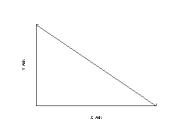
logical thinking structures and the ability to construct and interpret line
graphs. Journal of Research in Science Teaching, 31, 323-344.
[Ber94b] Berg,
C. A. and Smith, P. (1994). Assessing studentsπ abilities to construct and
interpret line graphs: Disparities between multiple-choice and free-response
instruments. Science Education, 78, 527-554.
[Bra87] Brasell,
H. (1987). The effect of real-time laboratory graphing on learning graphic
representations of distance and velocity. Journal of Research in Science
Teaching, 24, 385-395.
[Bre90] Brekelmans,
M., Wubbels, T., and CrÈton, H. (1990). A study of student perceptions of
physics teacher behavior. Journal of Research in Science Teaching, 27,
335-350.
[Car79] Carmines,
E. G. and Zeller, R. A. (1976). ≥Reliability and validity assessment.≤ Sage
University Paper Series n Quantitative Applications in the Social Sciences,
07-017. Beverly Hills. Sage Publications.
[Ceb97] Cebula,
D. Personal communication, July 10, 1997.
[Cha80] Champagne,
A. B., Klopfer, L. E., and Anderson, J. H. (1980). Factors influencing the
learning of classical mechanics. American Journal of Physics, 48,
1074-1079.
[Cle82] Clement,
J. (1982). Studentsπ preconceptions on introductory mechanics. American
Journal of Physics, 50, 66-71.
[Coh94] Cohn,
E. and Cohn, S. (1994). Graphs and learning in principles of economics. Research
on Economics Education, 84, 197-200.
[Dis96a] Di
Stefano, R. (1996). The IUPP evaluation: What we were trying to learn and how
we were trying to learn it. American Journal of Physics, 64,
49≠57.
[Dis96b] Di
Stefano, R. (1996). Preliminary IUPP results: Student reactions to in-class
demonstrations and to the presentation of coherent themes. American Journal
of Physics, 64, 58-68.
[Dil86] Dillon,
R. F. and Sternberg, R. J. (1986). Cognition and Instruction. New York.
Academic Press, Inc. 241-247.
[Ehr95] Ehrlich,
R. (1995). Giving a quiz every lecture. The Physics Teacher, 33,
378-9.
[Eri80] Ericsson,
K. A. and Simon, H. A. (1980). Verbal reports as data. Psychological Review,
87, 215-251.
[Esc97] Escalada,
L. T. and Zollman, D. A. (1997). An investigation on the effects of using
interactive digital video in a physics classroom on student learning attitudes.
Journal of Research in Science Teaching, 34, 467-489.
[Flo92] Flowers,
J. H. and Hauer, T. A. (1992). The earπs versus the eyeπs potential to assess
characteristics of numeric data: Are we too visuocentric? Behavior Research
Methods, Instruments, and Computers, 24, 258-264.
[Flo93] Flowers,
J. H. and Hauer, T. A. (1993) ≥Sound≤ alternatives to visual graphics for
exploratory data analysis. Behavior Research Methods, Instruments, and
Computers. 25, 242-249.
[Flo95] Flowers,
J. H. and Hauer, T. A. (1995). Musical versus visual graphs: cross-modal
equivalence in perception of time series data. Human Factors, 37,
553-569.
[Flo97] Flowers,
J. H., Buhman, D. C., and Turnage, K. D. (1997). Cross-modal equivalence of
visual and auditory scatterplots for exploring bivariate data samples. Human
Factors, 39, 341-351.
[Fry90] Frysinger,
Stephen P. (1990). Applied research in auditory data representation. SPIE -
Extracting Meaning from Complex Data: Processing, Display, Interaction, 1259.
130-139.
[Gar96] Gardner,
J., Lundquist, R., and Sahyun, S. (1996). TRIANGLE: A practical application of
non-speech audio for imparting information. Proceedings of ICAD 96
International Conference on Auditory Display. http://
www.santafe.edu/~icad/ICAD96/proc96/gardner5.htm
[Gar98] Gardner,
J. and Bulatov, V. (1998) Non-visual access to non textual information through
dotsplus and accessible VRML Proceedings of the 15th IFIP World Computer
Congress.
http://dots.physics.orst.edu/publications/dots_vrml.html
[Gal96] Gall,
M., Borg, W., and Gall, J. (1996). Educational Research: An Introduction,
6th
Ed. Longman Publishers. USA
[Gil94] Gillan,
D. J. and Lewis, R. (1994). A componential model of human interaction with
graphs: 1. linear regression modeling. Human Factors, 36,419-440.
[Gla93] Glasson,
G. E. and Lalik, R. V. (1993). Reinterpreting the learning cycle from a social
constructivist perspective: A qualitative study of teachersπ beliefs and
practices. Journal of Research in Science Teaching, 30, 187≠207.
[Gol95] Goldberg,
F. and Bendall, S. (1995). Making the invisible visible: A teaching/learning
environment that builds on a new view of the physics learner. American
Journal of Physics, 63, 978-991.
[Gra96] Grayson,
D. J. and McDermott, L. C. (1996). Use of the computer for research on student
thinking in physics. American Journal of Physics, 64, 557-565.
[Hal93] Halliday,
D., Resnick, R., and Walker, J. (1993) Fundamentals of Physics, Fourth
Edition. John Wiley. New York
[Ham96] Hammer,
D. (1996). More than misconceptions: Multiple perspectives on student knowledge
and reasoning, and an appropriate role for education research. American
Journal of Physics, 64, 1316-1325.
[Hay96] Hayes,
B. (1996). Speaking of mathematics. American Scientist, 84,
110-113.
[Hes92a] Hestenes,
D., Wells, M., and Swackhamer, G. (1992). Force Concept Inventory. The
Physics Teacher, 30, 141-158.
[Hes92b] Hestenes,
D. and Wells, M. (1992). A mechanics baseline test. The Physics Teacher,
30, 159-166.
[Huc96] Huck,
S. W. and Cormier, W. H. (1996). Reading Statistics and Research. Harper
Collins Pub. New York.
[Huf95] Huffman,
D., and Heller, P. (1995). What does the Force Concept Inventory actually
measure? The Physics Teacher, 33, 138-143.
[Ica96] ICAD
å96: Proceedings of the Third International Conference on Auditory Display.
http://www.santafe.edu/~icad/ICAD96/proc96/index.htm
[Kas95] Kashy,
E., Gaff, S. J., et al. (1995).
Conceptual questions in computer-assisted assignments. American Journal of
Physics, 63, 1000-1005.
[Ken97] Kennedy,
J. M. (1997). How the blind draw. Scientific American, 76≠81.
[Ker73] Kerlinger,
F. N. (1973). Foundations of Behavioral Research, second ed. Holt,
Rinehart and Winston, Inc. New York.
[Kir68] Kirk.
R. E. (1968). Experimental Design: Procedures for the Behavioral Sciences.
Wadsworth Pub. Co. 99-130, 522-555.
[Kni95] Knight,
R. D. (1995). The vector knowledge of beginning physics students. The
Physics Teacher, 33, 74-78.
[Kra94] Kramer,
G. Ed. (1994). Auditory display, SFI studies in the sciences of
complexity, Proc. Vol. XVIII, Addison-Wesley.
[Law87] Lawson,
R. A. and McDermott, L. C. (1987). Student understanding of the work-energy and
impulse-momentum theorems. American Journal of Physics, 55,
811-817.
[Lei90] Leinhardt,
G., Zaslavsky, O., and Stein, M. K. (1990). Functions, graphs, and graphing:
Tasks, learning, and teaching. Review of Educational Research, 60,
1-64.
[Lig81] Light,
P. H. and Humphreys, J. (1981). Internal spatial relationships in young
childrenπs drawings. Journal of Experimental Child Psychology, 31,
521-530.
[Lin87] Linn,
M. C., Layman, J. W., and Nachmias, R. (1987). Cognitive consequences of
microcomputer-based laboratories: Graphing skills development. Contemporary
Educational Psychology, 12, 244-253.
[Lun90] Lunney,
D. and Morrison R. C., (1990). Auditory presentation of experimental data. Extracting
Meaning from Complex Data: Processing, Display, Interaction, Edward J.
Farrell, Editor, Proc. SPIE 1259, 140
[Man85] Mansur,
D. L., Blattner, M. M. and Joy, K. I. (1985). Sound-graphs: a numerical data
analysis method for the blind. Proceedings of the Eighteenth Annual Hawaii
International Conference on System Sciences, 198-203
[May94] Mayer,
R. E. and Sims, V. K. (1994). For whom is a picture worth a thousand words?
Extensions of a dual-coding theory of multimedia learning. Journal of
Educational Psychology, 86, 389-401.
[Mcd87] McDermott,
L. C., Rosenquist, M. L., and van Zee, E. H. (1987). Student difficulties in
connecting graphs and physics: Examples from kinematics. American Journal of
Physics, 55, 503-513.
[Mcd92a] McDermott,
L. C. and Shaffer, P. S. (1992). Research as a guide for curriculum
development: An example from introductory electricity. Part I: Investigation of
student understanding. American Journal of Physics, 60, 994-1003.
[Mcd92b] McDermott,
L. C. and Shaffer, P. S. (1992). Research as a guide for curriculum
development: An example from introductory electricity. Part II: Design of
instructional strategies. American Journal of Physics, 60,
1003-1013.
[Mil74] Milroy,
R. and Poulton, E. C. (1974). Labeling graphs for improved reading speed. IEEE
Transactions on Professional communication, PC≠22, 30-33.
[Min95] Minghim,
R. and Forrest, A. R. (1995). An illustrated analysis of sonifircation for
scientific visualisation. Proceeding of the 6th IEEE Visualisation å95
Conference. 110-117.
[Mok87] Mokros,
J. R. and Tinker, R. F. (1987). The impact of microcomputer-based labs on
childrenπs ability to interpret graphs. Journal of Research in Science
Teaching, 24, 369-383.
[Moo86] Moore,
V. (1986). The relationship between childrenπs drawings and preferences for
alternative depictions of a familiar object. Journal of Experimental Child
Psychology, 42, 187-198.
[Nis77] Nisbett,
R. E. and DeCamp W. T. (1977). Telling more than we can know: verbal reports on
mental processes. Psychological Review, 84, 231-259.
[Nun78] Nunnally,
J. C. (1978). Psychometric Theory. McGraw-Hill. New York.
[Oha85] OπHanian,
H. C. (1985). Physics. W.W. Norton and Company. New York.
[Pet82] Peters,
P. C. (1982). Even honors students have conceptual difficulties with physics. American
Journal of Physics, 50, 501-508.
[Pol54] Pollack,
I. and Ficks, L. (1954). Information of elemantary multidimensional auditory
displays. Journal of the Acoustical Society of America, 26,
155-158.
[Pri74] Price,
J., Martuza, V. R., and Crouse, J. H. (1974). Construct validity of test items
measuring acquisition of information from line graphs. Journal of
Educational Psycology, 66, 152-156.
[Red94] Redish,
E. F. (1994). The implications of cognitive studies for teaching physics. American
Journal of Physics, 62, 796-803.
[Rief95] Reif,
F. (1995). Millikan Lecture 1994: Understanding and teaching important
scientific thought processes. American Journal of Physics, 63,
17-32.
[Rieb90] Rieber,
L. P. (1990). Using computer animated graphics in science instruction with
children. Journal of Educational Psychology, 82, 135≠140.
[Rot97] Roth,
W-M. and McGinn, M. K. (1997). Graphing: cognitive ability or practice? Science
Education, 81, 91-106.
[Rot96] Roth,
W-M. and Tobin, K. (1996). Staging Aristotle and natural observation against
Galileo and (stacked) scientific experiment of physics lectures as rhetorical
events. Journal of Research in Science Teaching, 33, 135-157.
[Sei91] Seigler,
R. (1991). Childrenπs Tinking, 2nd Ed. Prentice Hall. New Jersey. 17-55
[Sne89] Snedecor,
G. and Cochran, W. (1989). Statistical Methods, 8th Ed. Iowa State University
Press.
[Sou99] SoundMachine
(1999). http:// www.anutech.com.au/tprogman/
SoundMachine_WWW/welcome.html
[Ste97] Stevens,
R. D., Edwards, A. D. N., and Harling, P. A. (1997). Access to mathematics for
visually disabled students through multimodal interaction. Human-Computer
Interaction, 12, 47-92.
[Ton99] Tontata
(1999). MIDIGraphy. http://ux01.so-net.ne.jp/~mmaeda/ indexe.html
[Tho90] Thornton,
R. K. and Sokoloff, D. R. (1990). Learning motion concepts using real-time
microcomputer-based laboratory tools. American Journal of Physics, 58,
858-867.
[Tro80] Trowbridge,
D. E. and McDermott, L. C. (1980). Investigation of student understanding of
the concept of velocity in one dimension. American Journal of Physics, 48,
1020-1028.
[Tro81] Trowbridge,
D. E. and McDermott, L. C. (1981). Investigation of student understanding of
the concept of acceleration in one dimension. American Journal of Physics,
49, 242-253.
[Tru96] Trumper,
R. (1996). A cross-college age study about physics studentsπ conceptions of
force in pre-service training for high school teachers. Physics Education,
31, 227-236.
[Tuf90] Tufte,
E. (1990). Envisioning Information. Cheshire Conn. Graphics Press.
[Tur96] Turnage,
K. D., Bonebright, T. L., Buhman, D. C., and Flowers, J. H. (1996). The effects
of task demands on the equivalence of visual and auditory representations of
periodic numerical data. Behavior Research Methods, Instruments, and
Computers, 28, 270-274.
[Van91] Van
Heuvelen, A. (1991). Learning to think like a physicist: A review of
research-based instructional strategies. American Journal of Physics, 59,
891-897.
[Ver45] Vernon,
M. D. (1945). Learning from graphical material. British Journal of
Psychology, 36. 145-158.
[Ver52a] Vernon,
M. D. (1952). The use and value of graphical methods of presenting quantitative
data. Occupational Psychology, 22-34.
[Ver52b] Vernon,
M. D. (1952). the use and value of graphical methods of graphical material with
a written text. Occupational Psychology, 96≠100.
[Wai92] Wainer,
H. (1992). Understanding graphs and tables. Educational Researcher,
14-23.
[Wav89] Wavering,
M. J. (1989). Logical reasoning necessary to make line graphs. Journal of
Research in Science Teaching, 26, 373-379.
[Wild89] Wildbur,
P. (1989). Information Graphics. New York: Van Nostrand Reinhold Co.
[Wils96] Wilson,
Cathern M. (1996). Listen: A data sonification toolkit. M.S. Thesis,
Dept. of Computer Science, University of California, Santa Cruz.
APPENDICES
Appendix A Materials Relating to the Triangle Pilot Test
A.1. Overview
This appendix contains material used in the Triangle Pilot
test. These materials include the Informed Consent form, the Background Survey,
the Pre-test, Main test, the answer sheet used to record responses, and
Triangle screen images demonstrating the testing environment. Finally, there is
a summary of the results from this pilot test.
A.2. Informed Consent Form
Physics Department, Oregon State University
Title of Project: A
Comparison Between Auditory and Visual Graphing Methods.
Investigators: Steven
Sahyun, Graduate Research Assistant, Physics Department
John
Gardner, Professor, Physics Department
This
purpose of this study is to determine whether auditory graphing (data
representation using sound) is comparable to visually displayed graphs. In
particular, this study will be examining how well conclusions can be drawn from
auditory graphs vs. visually displayed graphs.
This
study involves three parts, a survey, a pre-test, and a main test. The survey
is to find out information on factors which may affect your knowledge of
graphical material. The pre-test is to find out information on basic graph
interpretation skills. The main test will be similar to the pre-test except
that there will be more questions. The main test will involve viewing a
computer monitor, and possibly listening to sounds generated by the computer.
If there are sounds involved, you will be able control the sound volume to a
level that you are comfortable with.
Any
information obtained from this study will be kept confidential. A code number
will be used to identify any test results or other information that is
provided. The only people who will have access to this information will be the
investigators and no names will be used in any data summaries or publications.
For subjects volunteering from a physics course, participation in this study
will result in credit towards one laboratory class, as determined by your
instructor, but results from the study will not be used to determine credit.
Participation
in this study is voluntary and you may either refuse to participate or withdraw
from the study at any time. You may stop the study at any time or take a break.
However, only completed tests will be used in the study and receive full
credit.
If
you have any questions about the research study and/or specific procedures,
please contact Steven Sahyun, Physics Department, 301 Weniger Hall; the phone
number is 737-1712. Any other questions should be directed to Mary Nunn,
Sponsored Programs Officer, OSU Research Office, 737-0670.
My
signature below indicates that I have read and that I understand the procedures
described above and give my informed and voluntary consent to participated in
this study. I understand that I will receive a signed copy of this consent
form.
|
______________________
Signature of subject (or subjectπs legally authorized
representative
|
______________________
Name of Subject
|
______________________
Date signed
|
|
______________________
Signature of Investigator
|
|
______________________
Date signed
|
A.3. Survey
Survey: Background Information:
1. Gender:
M F
2. Age:
3. Have you taken a high school physics course?
Y N
4.
Number of years of
college level physics: 0
1 2 3 4 5+
5. Have
you taken courses other than physics where graphed data was important? Y N
If
yes, please describe:
6. Have
you learned graphing techniques other than from academic settings?
7. If
you have had any musical training, please describe instrument or field and
length of time of study:
8. Do
you have any difficulties (i.e. vision or hearing) that may affect your ability
to receive information?
A.4. Pre-test
Questions 9 - 12 refer to the following graph describing the
profile of a surface; the y-axis represents height and the x-axis represents
distance.
9. How many
relative maxima (locations where a point
has a greater y-axis value than the points to either side) are
there?
0 1 2 3 4 5 6 7
10. The
absolute maximum (greatest y value) is at which point?
1 2 3 4 5 6 7
11. The absolute minimum (lowest y value) is at which point?
1 2 3 4 5 6 7
12. The
largest magnitude slope (greatest change in y for a change in x) occurs where?
A)
Between
points 1 and 2. D)
Between
points 4 and 5.
B)
Between
points 2 and 3. E)
Between
points 5 and 6.
C)
Between
points 3 and 4. F)
Between
points 6 and 7.
13. The
following graph is of an objectπs motion.
The y-axis represents the objectπs distance, and the x-axis represents
time.
Which sentence is the best interpretation of this
graph(please circle answer)?
A) The object is
moving with a constant, non-zero acceleration.
B) The object
does not move.
C) The object is
moving with a linearly increasing velocity.
D) The object is
moving with a constant velocity.
E) The object is
moving with a decreasing acceleration.
A.5. Main Test
Question 1:
This is a graph of an objectπs motion. The y-axis represents the objectπs
distance, and the x-axis represents time.
Which sentence is the best interpretation of this graph?
A) The
object is moving with a constant non-zero acceleration.
B) The
object does not move.
C) The
object is moving with a uniformly increasing velocity.
D) The
object is moving with a constant velocity.
E) The
object is moving with a uniformly increasing acceleration.
Question 2:
This is a graph of an objectπs motion. The y-axis represents the objectπs
distance, and the x-axis represents time.
Which sentence is the best interpretation of this graph?
A) The object
is moving with a constant non-zero acceleration.
B) The
object does not move.
C) The
object is moving with a uniformly increasing velocity.
D) The
object is moving with a constant velocity.
E) The
object is moving with a uniformly increasing acceleration.
Question 3:
This is a graph of an objectπs motion. The y-axis represents the objectπs
displacement from a reference point, and the x-axis represents time.
Which sentence is the best interpretation?
A) The
object rolls along a flat surface.
Then it rolls down a hill, and then finally stops.
B) The
object doesnπt move at first. Then
it rolls down a hill and finally stops.
C) The
object is moving at a constant velocity.
Then it slows down and stops.
D) The
object travels along a flat area, moves down a hill toward the reference point
and then keeps moving.
E) The
object doesnπt move at first. Then
it moves towards the reference point and then finally stops.
Question 4:
This is a graph of an objectπs motion. The y-axis represents the objectπs
velocity, and the x-axis represents time.
Which sentence is the best interpretation of the objectπs motion?
A) The
object is moving with constant acceleration.
B) The
object is moving with uniformly decreasing acceleration.
C) The
object is moving with uniformly increasing velocity.
D) The
object is moving at a constant velocity.
E) The
object does not move.
Question 5:
This is a graph of an objectπs motion. The y-axis represents the objectπs velocity,
and the x-axis represents time.
Which sentence is the best interpretation of the objectπs motion?
A) The
object is moving with a constant acceleration.
B) The
object is moving with a decreasing acceleration.
C) The object
is moving with uniformly increasing velocity.
D) The
object is moving at a constant velocity.
E) The
object does not move.
Question 6:
This is a graph of an objectπs motion. The y-axis represents the objectπs
velocity, and the x-axis represents time.
Locate the part of the graph when the acceleration is
greatest.
A) Before the maximum velocity.
B) Between the maximum velocity and the next (occurring
at a later time) minimum velocity.
C) Between the local minimum and the constant velocity
region.
D) During the constant velocity region.
E) The
acceleration is never greatest.
Question 7:
The following graph concerns the kinetic energy of a
falling ball. The y-axis
represents the kinetic energy and the x-axis represents the distance that the
ball has fallen.
Which sentence is the best interpretation of the graph?
A) The
kinetic energy of the ball remains constant.
B) The
kinetic energy is increasing linearly with distance.
C) The
kinetic energy increases as the square of the distance.
D) The total
energy of the ball remains constant.
E) The
kinetic energy is decreasing linearly with distance.
Question 8:
The following graph concerns the gravitational potential
energy of a falling ball. The
y-axis represents the potential energy and the x-axis represents the distance
that the ball has fallen.
Which sentence is the best interpretation of the graph?
A) The
gravitational potential energy of the ball remains constant.
B) The total
energy of the ball remains constant.
C) The
gravitational potential energy is increasing linearly with distance.
D) The
gravitational potential energy increases as the square of the distance.
E) The
gravitational potential energy is decreasing linearly with distance.
Question 9:
The following graph is for the elastic potential energy
of a spring. The y-axis represents
the potential energy of the spring, and the x-axis represents the distance that
the spring is compressed.

Which sentence is the best interpretation of the graph?
A) The
elastic potential energy increases as the square of the distance that the
spring is compressed.
B) The
elastic potential energy is increasing linearly with the distance the spring is
compressed.
C) The
elastic potential energy of the spring remains constant.
D) The total
energy of the spring remains constant.
E) The
elastic potential energy is decreasing.
Question 10:
The following graph relates frequency of light to its
wavelength. The y-axis represents
frequency of light and the x-axis represents the wavelength.
Which sentence is the best interpretation from the graph?
A) The
frequency increases linearly with
wavelength.
B) The
frequency decreases linearly with
wavelength.
C) The
frequency is proportional to 1 / wavelength.
D) The
frequency is constant with the wavelength.
E) The
frequency is not related to the wavelength.
Question 11:
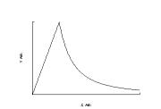
The following graph refers to the gravitational force
produced by a solid, uniformly dense sphere acting on a test mass m. The y-axis represents the gravitational
force, and the x-axis represents the distance from the center of the sphere.
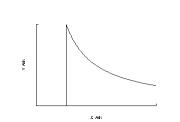
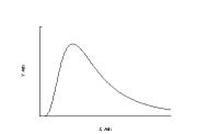
Which sentence is the best interpretation from the graph?
A) The
gravitational force increases linearly with distance.
B) The
gravitational force decreases linearly with distance.
C) The
gravitational force first increases linearly, then decreases linearly.
D) The
gravitational force first increases linearly, then is proportional to 1 /
(distance)2.
E) The
gravitational force is not related to the distance.
11b. What
does the peak on the graph represent?
Question 12:
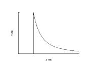
The following graph refers to the electric field produced
by a charged spherical shell. The
y-axis represents the Electric Field, and the x-axis represents the distance
from the center of the sphere.
Which sentence is the best interpretation from the graph?
A) The
electric field first increases linearly, then decreases linearly.
B) The
electric field is zero, then is proportional to 1 / (distance)2.
C) The
electric field increases linearly with distance.
D) The
electric field decreases linearly with distance.
E) The
electric field is not related to the distance.
12b. What
does the peak on the graph represent
Question 13:
The following graph represents the deflection of an
electron traveling through an electric field produced by two parallel
plates. The electron enters with
an initial velocity v0 and travels from the left to the right. The y-axis represents the distance in
the y direction that the electron has traveled, and the x-axis represents the
distance traveled in the x direction.
Which sentence best describes the path of the electron?
A) The
electron passes through undeflected.
B) The
electron is deflected by a linearly increasing distance while between the
plates.
C) The
electron is deflected proportional to (distance)2 while between the
plates.
D) The
electron is deflected by a linearly decreasing distance while between the
plates.
E) The
electron does not pass between the plates.
Question 14:
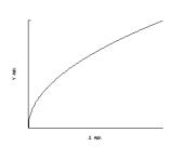
When water depth is greater than three wavelengths, the
speed of ocean waves in water is approximated by the following graph, where the
y-axis represents the velocity of ocean waves and the x-axis represents the
wavelength.
Which sentence is the best interpretation from the graph?
A) The speed
of ocean waves is proportional to à(wavelength).
B) The speed
of ocean waves increases linearly with the wavelength.
C) The speed
of ocean waves is proportional to (wavelength)2.
D) The speed of
ocean waves decreases linearly with the wavelength.
E) The
speed is not dependent on the wavelength.
A.6. Answer Sheet
Please mark your answers of the graph test on this page. For multiple-choice questions, please
circle the appropriate letter, for short answer questions (11b and 12b) please
write your answer on the space provided.
If you have any additional comments about the question, please write a
note in the area to the right of the answer.
Answer: Additional
comments:
1. A B C D E
2. A B C D E
3. A B C D E
4. A B C D E
5. A B C D E
6. A B C D E
7. A B C D E
8. A B C D E
9. A B C D E
10. A B C D E
11. A B C D E
11b. .
12. A B C D E
12b. .
13. A B C D E
14. A B C D E
A.7. Screen Image of the TRIANGLE program
This is an image of the screen that was seen by the subjects
during the Triangle pilot test. The Sound group had the lower right corner of
the screen covered so that they were unable to view the graph.
A.8. Summary of Results from Triangle Pilot Test
Appendix B Material Relating to the Web Pilot Test
B.1. Overview
This appendix contains material used in the Web Pilot test.
These materials include the Introductory page and Informed Consent form, the
Background Survey, the Pre-test, and Main test Web pages demonstrating the
testing environment. The test questions were similar to those used in the
Triangle Pilot test shown in Appendix A. There is a tabulated summary of the
results obtained from the Web Pilot test in section B6. Finally, there is a
brief analysis of the distribution of test scores.
B.2. Introductory Page and Informed Consent Form
Welcome
The object of this test is to compare studentsπ ability
to answer questions from data contained in graphical formats. Two types of
graphs are utilized, pictorial graphs which almost everyone is familiar with,
and sonified data graphs (data represented by sound), which is much less
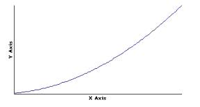
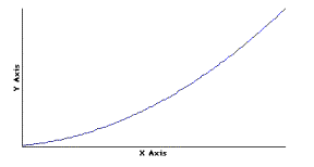
common. For the pictorial graphs, you will need a web browser such as Netscape
or Explorer which can display .gif images. An example of such an image is the
following:
The sonified data will be available in several sound
formats: QuickTime, MIDI, and .wav files. The QuickTime .mov files are embedded
in the pages and appear as a gray bar with controls. After these bars are links
to midi and .wav files for downloading. QuickTime is the recommended format as
it will be displayed on each page and is most convenient to use. The midi files
are small (2 Kb) while the equivalent .wav files are large (about 130 Kb) and
take a longer time to load. To hear the sound graphs you will need a
multi-media computer capable of
generating the sounds, such as a PC with a sound card, or a Mac; and the appropriate software. To listen to the
QuickTime files, you will need Appleπs
QuickTime plug-in for your web browser. The following is a sample sound graph.
Please make sure you can hear this
graph before taking the test.
 MIDI WAV
If you do not see a bar above this line, and if QuickTime
is installed, there may have a
conflict with is your browser, if this is the case try reloading the
page. If you do see the control bar, click on the ≥play≤ arrow to listen to the
graph. The slider bar gives an
indication of how much time has elapsed, you can move the slider to any point
in the graph and play from that point.
To listen to the graph as a midi file, click on the MIDI
link above; your browser should be configured to automatically start a midi
player to listen to the file. You can also download the file by shift-clicking
on the link. To listen to the graph as a .wav file, click on the WAV link
above; again, your browser should be configured to automatically start a sound
player after the file has downloaded. If you can hear the QuickTime graph then
you do not need to use these links.
The Y axis of the sound graph is represented by pitch and
the X axis is represented by time. The second derivative, or the rate at which
the graph is increasing or decreasing is represented by the background
≥clicks.≤ Play the graph several times and match the sound graph to the picture
above.
Go to the Sonitypes Page.
The Sonitypes Page contains a more detailed explanation
and basic examples of the sound graphs. Please follow this link to become more
acquainted with the basic graph types that will be used in the test. Return
here after listening to the graphs.
Statement of Informed Consent
Physics Department, Oregon State University
Title of Project: Comparison Between Auditory and Visual
Graphing Methods.
Investigators:
Steven Sahyun, Graduate Research Assistant, Physics Department.
John Gardner, Professor, Physics Department.
This purpose of this study, as stated above, is to
determine whether auditory graphing (data representation using sound) is
comparable to visually displayed graphs. In particular, this study will be
examining how well conclusions can be drawn from auditory graphs vs. visually
displayed graphs.
How the test will work:
The format for this test is divided into several parts.
First subjects will be asked to give their name and a school code which is used
to identify which testing group the student is from.
Next, a demographic survey will be presented to the
subject for completion. This is to receive some indication of the subjectπs
background and training. A Pre-test follows the survey and consists of five
questions about two different graphs.
Finally, the subject is given a series of questions
relating to physics and graphs. The questions are to be answered from the
information contained within the graphs, although the subject matter is drawn
from material that students are exposed to during a first-year general physics
course at a typical college or university. Subjects will be randomly assigned
to one of three groups. Those using picture graphs, those using sound graphs,
and those using both sound and picture graphs (please listen to the graphs
before answering the questions!) There will be 14 questions in the main test.
Only data from subjects who answer all 14 test questions will be used.
It should be noted that all responses are being
transferred on the Internet, and are not encrypted. However, reasonable
attempts at confidentiality are made in that the subjectπs name will not appear
with, or be stored with, any of their responses. Names will not be used in any
publications or presentations of the data obtained.
It should also be noted that in cases where student
subjects are taking this test for extra credit in a course, a list of which
students have taken the test will be forwarded to the respective schoolπs
instructor so that those subjects may receive credit. Results of the study will
not be used to determine credit. Also, a summary listing of the average
responses to the test questions will be available to the instructor.
Participation in this study is voluntary and you may
either refuse to participate or withdraw from the study at any time, although
full participation is greatly appreciated.
If you have any questions about the research study and/or
specific procedures, please contact:
Steven Sahyun
Physics Department
Oregon State University
301 Weniger Hall
Corvallis OR, 97330
USA
The phone number is (541) 737-1712. Any other questions
should be directed to Mary Nunn, Sponsored Programs Officer, OSU Research
Office, Oregon State University, Corvallis, OR, 97331. The phone number is:
(541) 737-0670.
After reviewing and agreeing to the above procedure,
Start the test.
Questions about this test? Send me e-mail:
sahyuns@ucs.orst.edu
Last modified October 12, 1997.
B.3. Survey
The survey questions were similar to those used in the
Triangle Pilot, but with slight modifications as noted in chapter 7. The survey utilized radio buttons and
text box areas for selecting and typing responses. A screen shot of the survey
is displayed in Figure B.3.1.
|
� EMBED Word.Picture.8
��
Figure B.3.1. Screen Image
of the Web Pilot Survey
|
B.4. Pre-test
The Web Pilotπs pre-test text and images were the same as in
the Triangle Pilot, but the layout of the Web page contained radio buttons for
answer selection. The pre-test is displayed in Figure B.4.1.
|
Figure B.4.1 Screen image of the Pre-test.
|
B.5. Main Test
Figure B.5.1 is a screen image of a typical question page
presented to the subjects. The subjects chose their answer via radio button
selections. They were required to
select one choice before the next question would be displayed. The questions were similar to those
displayed in Appendix A but with the modifications as noted in Chapter 7.
|
Figure B.5.1 Screen image
from the Web Pilot Main Test
|
B.6. Summary of Results from the Web Pilot Test
Tables B.6.1 and B.6.2 are summaries of the results obtained
from the Web Pilot test. The
tables are divided into four columns: All, Vision, Both, and Sound. The All category represents the average
of all subjects taking the test, Vision represents the subjects given the test
with visually presented graphs, Both represents the group given the test with
both visual and auditory graphs, and Sound represents the subjects given the
test with only auditory graphs.
Table B.6.1 contains the average scores for the test per
group, as well as demographic information obtained from the survey. This
information included the percentage of females taking the test, the average
age, whether or not they had taken a physics course in high school, and whether
or not they had taken previous physics courses.
|
Table B.6.1 . Summary of Results from the Web Pilot Test.
|
|
Group
|
|
|
|
|
|
All
|
Vision
|
Both
|
Sound
|
|
Pre-test
|
|
|
|
|
|
Avg.
|
4.14
|
4.27
|
4.00
|
4.23
|
|
std. dev.
|
0.94
|
0.89
|
0.98
|
0.96
|
|
Main test
|
|
|
|
|
|
Avg.
|
8.04
|
9.29
|
9.18
|
5.65
|
|
std. dev.
|
3.55
|
3.21
|
3.26
|
2.91
|
|
Number of
Subjects.
|
221
|
72
|
74
|
75
|
|
Gender %F
|
54%
|
60%
|
43%
|
59%
|
|
Avg. Age
|
21
|
21
|
21
|
21
|
|
H.S. Phys.
|
59%
|
63%
|
61%
|
53%
|
|
Coll. Phys.
|
16%
|
21%
|
15%
|
13%
|
|
|
Table B.6.2 Summary of Results from the Web Pilot Test, continued.
|
|
% correct
|
|
|
Question
|
All
|
Vision
|
Both
|
Sound
|
|
|
Pre-test
|
|
|
|
|
|
|
P1
|
74%
|
77%
|
71%
|
78%
|
|
|
P2
|
97%
|
97%
|
97%
|
96%
|
|
|
P3
|
97%
|
99%
|
96%
|
95%
|
|
|
P4
|
80%
|
83%
|
78%
|
81%
|
|
|
P5
|
65%
|
71%
|
58%
|
73%
|
|
|
Main Test
|
|
|
|
|
|
|
M1
|
63%
|
68%
|
58%
|
30%
|
|
|
M2
|
66%
|
67%
|
65%
|
36%
|
|
|
M3
|
56%
|
59%
|
53%
|
22%
|
|
|
M4
|
73%
|
71%
|
75%
|
57%
|
|
|
M5
|
10%
|
11%
|
10%
|
16%
|
|
|
M6
|
67%
|
68%
|
65%
|
23%
|
|
|
M7
|
76%
|
81%
|
71%
|
64%
|
|
|
M8
|
86%
|
84%
|
89%
|
73%
|
|
|
M9
|
71%
|
69%
|
74%
|
54%
|
|
|
M10
|
70%
|
69%
|
71%
|
41%
|
|
|
M11
|
76%
|
71%
|
81%
|
41%
|
|
|
M12
|
73%
|
71%
|
81%
|
41%
|
|
|
M13
|
68%
|
67%
|
69%
|
42%
|
|
|
M14
|
68%
|
67%
|
69%
|
31%
|
|
|
Avg. Time (min.)
|
14.18
|
13.28
|
15.12
|
16.93
|
|
|
|
|
|
|
|
|
|
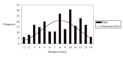
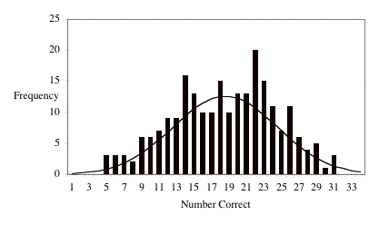
B.7. Histogram and Normal Distribution of Data.
One of the assumptions made when analyzing the data was that
it follows a normal distribution population. The normal population is modeled by the Gaussian curve given
by:
�
EMBED Equation.3 �� (B.7.1)
where X is the average value of the
data, and s
is the standard deviation.
Figure B.7.1
compares a histogram of the distribution of the total number of correct
responses for all subjects to the Gaussian ideal. Obviously the distributions do not match well, but this can
be partially attributed to the low scores from the Sound group as well as the
small number of questions. In addition, the fit depends greatly on how the
scores are grouped. Figure B.7.1 displays the data when grouped by the number
of correct answers.
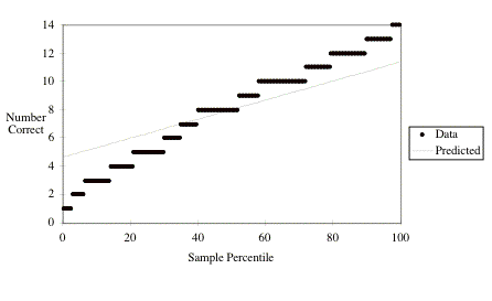
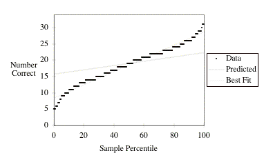
A method for comparison of data distributions to the ideal
Gaussian distribution is with a Normal Probability plot. In this graph the data is ordered from
smallest to largest and then plotted with the pointsπ value for the y axis, and the probability that an observation from a
normal distribution is smaller than the data point for the x axis
value. [Sne89 p. 59] Ideally, the
data points should lie on a line with a slope of  . Sometimes the
values are plotted as the standard normal deviate, in which case the x axis
has units of the standard deviation and the slope is s.
. Sometimes the
values are plotted as the standard normal deviate, in which case the x axis
has units of the standard deviation and the slope is s.
Figure B.7.2
shows that the distribution deviates from the normal. The fact that the
distribution does not completely follow that of the normal may introduce some
inaccuracies in the comparative tests as the Fcritical and tcritical
values assume normal distributions.
C.1. Overview
This appendix contains material used in the Main Auditory
Graph test. These materials include the Introductory page and Informed Consent
form, the Introduction to Auditory Graphs Page, a sample page from the Main
test and the questions and graphs used in the test. Following the test
questions, there is a summary of the results obtained from the Main Auditory
Graph test. Finally, there is a brief analysis of the distribution of test
scores.
C.2. Introductory page and Informed Consent Form
Welcome
The object of this test is to compare studentsπ ability to
answer questions from data contained in graphical formats. Two types of graphs
are utilized, pictorial graphs which almost everyone is familiar with, and
sonified data graphs (data represented by sound), which is much less common.
For the pictorial graphs, you will need a web browser such as Netscape or
Explorer which can display .gif images. An example of such an image is the
following:
The sonified data will be available in several sound formats:
QuickTime, MIDI, and .wav files. The QuickTime .mov files are embedded in the
pages and appear as a gray bar with controls. After these bars are links to
midi and .wav files for downloading. QuickTime is the recommended format as it
will be displayed on each page and is most convenient to use. The midi files
are small (2 Kb) while the equivalent .wav files are large (about 130 Kb) and
take a longer time to load. To hear the sound graphs you will need a
multi-media computer capable of
generating the sounds, such as a PC with a sound card, or a Mac; and
the appropriate software. To
listen to the QuickTime files, you
will need Appleπs QuickTime plug-in for your web browser. The following is a
sample sound graph. Please make sure
you can hear this graph before taking the test.

MIDI
WAV
If you do not see a bar above this line, and if QuickTime is
installed, there may have a
conflict with is your browser, if this is the case try reloading the
page. If you do see the control bar, click on the ≥play≤ arrow to listen to the
graph. The slider bar gives an
indication of how much time has elapsed, you can move the slider to any
point in the graph and play from that point.
To listen to the graph as a midi file, click on the MIDI link
above; your browser should be configured to automatically start a midi player
to listen to the file. You can also download the file by shift-clicking on the
link. To listen to the graph as a .wav file, click on the WAV link above;
again, your browser should be configured to automatically start a sound player
after the file has downloaded. If you can hear the QuickTime graph then you do
not need to use these links.
The Y axis of the sound graph is represented by pitch and the
X axis is represented by time. The second derivative, or the rate at which the
graph is increasing or decreasing is represented by the background ≥clicks.≤
Play the graph now to be sure your computer is configured correctly for these
sounds. In the following pages, there will be detailed explanations and basic
examples on how to listen to these graphs.
Before proceeding, please take a moment to read the following
document.
Statement of Informed Consent
Physics Department, Oregon State University
Title of Project: Comparison Between Auditory and Visual
Graphing Methods.
Investigators:
Steven Sahyun, Graduate
Research Assistant, Physics Department.
John Gardner, Professor,
Physics Department.
This purpose of this study, as stated above, is to determine
whether auditory graphing (data representation using sound) is comparable to
visually displayed graphs. In particular, this study will be examining how well
conclusions can be drawn from auditory graphs vs. visually displayed graphs.
How the test will work:
The format for this test is divided into several parts.
First, an introduction to auditory graphs is given, with samples and questions
about these graphs. This is to provide a common basis of understanding.
Subjects will then be asked to give their name and a school
code which is used to identify which testing group the student is from.
Next, a demographic survey will be presented to the subject
for completion. This is to receive some indication of the subjectπs background
and training. A Pre-test follows the survey and consists of five questions
about two different graphs.
Finally, subjects are given a series of 17 graph questions
relating to mathematics, and 17 questions relating to physics graphs. The
questions are to be answered from the information contained within the graphs,
although the subject matter is drawn from material that students are exposed to
during a first year general physics course at a typical college or university.
Subjects will be randomly assigned to one of three groups.
Those using picture graphs, those using sound graphs, and those using both
sound and picture graphs (please listen to the graphs before answering the
questions!)
Only data from subjects who answer all 34 test questions will
be used.
It should be noted that all responses are being transferred
on the Internet, and are not encrypted. However, reasonable attempts at
confidentiality are made in that the subjectπs name will not appear with, or be
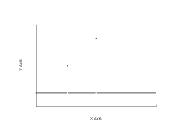
stored with, any of their responses. Names will not be used in any publications
or presentations of the data obtained.
It should also be noted that in cases where student subjects
are taking this test for extra credit in a course, a list of which students
have taken the test will be forwarded to the respective schoolπs instructor so
that those subjects may receive credit. Results of the study will not be used
to determine credit, only the fact that the test has been taken. Also, a
summary listing of the average responses to the test questions will be
available to the instructor.
The test is estimated to take about 30 - 40 minutes.
Participation in this study is voluntary and you may either
refuse to participate or withdraw from the study at any time, although full
participation is greatly appreciated. You may take a break at any time, just be
sure not to loose the web page question that you are on. If there should be a
technical problem (crash) during the test, you will need to start over.
If you have any questions about the research study and/or
specific procedures, please contact:
Steven Sahyun
Physics Department
Oregon State University
301 Weniger Hall
Corvallis OR, 97330
USA
The phone number is (541) 737-1712. Any other questions
should be directed to Mary Nunn, Sponsored Programs Officer, OSU Research
Office, Oregon State University, Corvallis, OR, 97331. The phone number is:
(541) 737-0670.
After reviewing the above statement, please click on the link
below:
I agree to this test.
Questions about this test? Send me e-mail:
sahyuns@ucs.orst.edu
Last modified April 28, 1998.
C.3. Introduction to Auditory Graphs
Before taking the test, subjects were given a web page
introducing auditory graphs. This
web page served as a training method for the auditory graphs. To provide equivalency between groups,
all subjects were presented with this page.
Introduction to Auditory
Graphs
Before the test begins, a short explanation about Auditory
graphs is necessary for those who will be listening to the graphs instead of
seeing them. It is a random process as to who gets which graph type, so everyone should understand how to listen to
these graphs.
The basic auditory graph involves mapping the Y axis data to
pitch, and the X axis data to time. So the greater the Y value, the higher the
frequency of the sound, and the greater the X value the later the sound will be
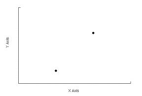
played. As an example, in the following graph there are two (X,Y) data points:
(1,1) and (2,4). The (1,1) point can be heard first, and has a low tone, the
(2,4) point is played second and has a higher tone.

MIDI WAV
Please play this graph now.
Note: The concept of 0 is difficult to represent in an
auditory graph. We have used the
following tone to represent 0 in all of the graphs in this test:

MIDI
WAV
For most of the graphs that you will encounter, the lowest
tone played will represent 0.
A series of points would be played as a series of tones. The
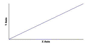
following graph gives an
example of a series of points that increase in both X and Y
values:

MIDI WAV
Please play this graph now.
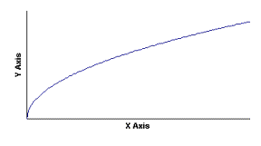
In previous studies, it was noticed that it is difficult to
tell when a graph is linearly
increasing (i.e. Y = X), vs. when there is some curvature to
the graph (i.e. Y = X2). For
this reason, a sound to alert the listener to the slope and
curvature of a graph has been
added. This sound is heard as a series of ≥drum≤ beats.
The slope of a graph is defined as the rise/run or  . The greater the slope, the more
rapid the beat.
Please listen to the following graphs to determine which one
has the greatest slope.
|

1:
MIDI WAV
|
|

2:
MIDI WAV
|
(The second
graph has a greater slope)
The pitch of the drum beat indicates the curvature of the
graph. The curvature is defined
as the change in the slope, or  . When the
curvature is positive (
. When the
curvature is positive ( ), as it is for the graph of Y = X2, the graph is
bowl shaped, and is represented with a low pitched drum beat. This graph looks
and
), as it is for the graph of Y = X2, the graph is
bowl shaped, and is represented with a low pitched drum beat. This graph looks
and
sounds like the following:
 MIDI WAV
Please play this graph now.
When the curvature is negative ( ) as in
  , the graph is hat, or hill shaped.
This type of graph has a high pitched drum beat. This graph
looks and sounds like the
following:

MIDI
WAV
Please play this graph now.
When there is no curvature ( ), as was seen in the linear graphs above,
(remember, the graph can still have a non-zero slope) the
pitch of the drum beat is
between those of the positive or negative curvature graphs.
If you would like to see and hear more examples, please go to
the Sonitype page.
If this method of auditory graphing is clear, youπre ready to
Start the Test
C.4. Pre-test and Survey
The Pre-test and Survey questions and layout were identical
to those used in the Web Pilot test.
For descriptions and screen images, see Appendix B, sections 3 and 4.
C.5. Main Auditory Graph Test
The question layout for the Main test questions was similar
to the layout for the Web Pilot test, although an extra sound bar was included
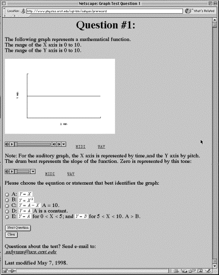
for use as a reference to 0. Figure C.5.1 is a screen image of a typical
question page presented to the subjects.
The questions of the test and their related graphs follow the figure.
Question 1:
The following graph represents a mathematical function.
The range of the X axis is 0 to 10.
The range of the Y axis is 0 to 10.

Please choose the equation or statement that best
identifies the graph:
A: 
B: 
C:  A = 10.
D:  A is a constant.
E:  for 0 < X
< 5; and
for 0 < X
< 5; and  for 5 < X
< 10. A > B.
for 5 < X
< 10. A > B.
Answer is: D
Question 2:
The following graph represents a mathematical function.
The range of the X axis is 0 to 10.
The range of the Y axis is 0 to 10.

Please choose the equation or statement that best
identifies the graph:
A: 
B: 
C:  A = 10.
D:  A is a constant.
E:  for 0 < X
< 5; and
for 0 < X
< 5; and  for 5 < X
< 10. A > B.
for 5 < X
< 10. A > B.
Answer is: A
Question 3:
The following graph represents a mathematical function.
The range of the X axis is 0 to 10.
The range of the Y axis is 0 to 10.
Please choose the equation or statement that best
identifies the graph:
A: 
B: 
C:  A = 10.
D:  A is a constant.
E:  for 0 < X
< 5; and
for 0 < X
< 5; and  for 5 < X
< 10. A > B.
for 5 < X
< 10. A > B.
Answer is: C
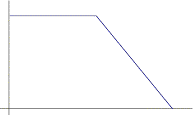
Question 4:
The following graph represents a mathematical function.
The range of the X axis is 0 to 10.
The range of the Y axis is 0 to 10.

Please choose the equation or statement that best
identifies the graph:
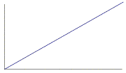
A: Y = X.
B: Y = A. A is a constant.
C: Y = A - X. A = 10.
D: Y = A for 0 < X < 5; and Y = B for 5 < X <
10. A > B.
E: Y = A for 0 < X < 5; and Y = B for 5 < X <
10. A < B.
Answer is: D
Question 5:
The following graph represents a mathematical function.
The range of the X axis is 0 to 10.
The range of the Y axis is 0 to 10.
Please choose the equation or statement that best
identifies the graph:
A: Y = X.
B: Y = A. A is a constant.
C: Y = A - X. A = 10.
D: Y = A for 0 < X < 5; and Y = B for 5 < X <
10. A > B.
E: Y = A for 0 < X < 5; and Y = B for 5 < X <
10. A < B.
Answer is: E
Question 6:
The following graph represents a mathematical function.
The range of the X axis is 0 to 1.
The range of the Y axis is 0 to 1.

Please choose the equation or statement that best
identifies the graph:
A: 
B: 
C: 
D: 
E: 
Answer is: D
Question 7:
The following graph represents a mathematical function.
The range of the X axis is 0 to 10.
The range of the Y axis is 0 to 100.

Please choose the equation or statement that best
identifies the graph:
A: 
B: 
C: 
D: 
E: 
Answer is: B
Question 8:
The following graph represents a mathematical function.
The range of the X axis is 1 to 10.
The range of the Y axis is 0 to 1.
Please choose the equation or statement that best
identifies the graph:
A: 
B: 
C: 
D: 
E: 
Answer is: C
Question 9:
The following graph represents a mathematical function.
The range of the X axis is 0 to 4.
The range of the Y axis is 0 to 1.
Please choose the equation or statement that best
identifies the graph:
A: Y = X.
B: Y = 0 for 0 < X < 1; and Y = X for 1 < X <
4.
C: Y = X for 0 < X < 1; and Y = 1 - X for 1 < X
< 4.
D: Y = 0 for 0 < X < 1; and Y = 1/X for 1 < X
< 4.
E: Y = X for 0 < X < 1; and Y = 1/X for 1 < X
< 4.
Answer is: E
Question 10:
The following graph represents a mathematical function.
The range of the X axis is 0 to 4.
The range of the Y axis is 0 to 1.
Please choose the equation or statement that best
identifies the graph:
A: Y = X.
B: Y = 0 for 0 < X < 1; and Y = X for 1 < X <
4.
C: Y = X for 0 < X < 1; and Y = 1 - X for 1 < X
< 4.
D: Y = 0 for 0 < X < 1; and Y = 1/X for 1 < X
< 4.
E: Y = X for 0 < X < 1; and Y = 1/X for 1 < X
< 4.
Answer is: D
Question 11:
The following graph represents a mathematical function.
The range of the X axis is 0 to 100.
The range of the Y axis is 0 to 10.
Please choose the equation or statement that best
identifies the graph:
A: 
B: 
C: 
D: 
E: 
Answer is: E
Question 12:
The following graph represents a mathematical function.
The range of the X axis is 0 to 10.
The range of the Y axis is 0 to 125.

Please choose the equation or statement that best
identifies the graph:
A: 
B: 
C: 
D: 
E: 
Answer is: A
Question 13:
The following graph represents a function with one or
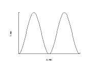
more maxima.
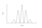
Which statement best describes this graph?
A: This graph contains 5 peaks of equal magnitudes.
B: This graph contains 5 peaks of unequal magnitudes.
C: This graph contains 5 peaks of random magnitudes.
D: This graph contains 10 peaks of random magnitudes.
E: This graph contains only 1 peak.
Answer is: B
Question 14:
The following graph represents a mathematical function.
The range of the X axis is 0 to 10.
The range of the Y axis is 0 to 1.
Please choose the equation or statement that best
identifies the graph:
A: 
B: 
C: 
D: 
E: 
Answer is: B
Question 15:
The following graph represents a function with one or
more discontinuities.
Which statement best describes this graph?
A: This graph contains 2 points of discontinuity whose
function values are of unequal magnitudes.
B: This graph contains 2 points of discontinuity whose
function values are of equal magnitudes.
C: This graph contains 2 points of discontinuity at which
the function is undefined.
D: This graph contains 4 points of discontinuity whose
function values are of unequal magnitudes.
E: This graph contains 4 points of discontinuity whose
function values are of equal magnitudes.
Answer is: A
Question 16:
The following graph represents a mathematical function.
The range of the X axis is 0 to 2 Pi (= 6.3).
The range of the Y axis is 0 to 1.
Please choose the equation or statement that best
identifies the graph:
A: 
B: 
C: 
D: 
E: 
Answer is: C
Question 17:
The following graph represents a mathematical function.
The range of the X axis is 0 to 10.
The range of the Y axis is 0 to 10.
Please choose the equation or statement that best
identifies the graph:
A: 
B: 
C: 
D: 
E: 
Answer is: E
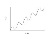
Question 18:
This is a graph of the motion of an object.
The X axis represents time, and has a range of 0 to 10
seconds.
The Y axis represents the objectπs distance from a
reference point, and has a range of 0 to10 m.
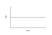
Choose the sentence that is the best interpretation of
the graph:
A: The object is moving with a constant non-zero linear
acceleration.
B: The object does not move.
C: The object is moving with an acceleration whose
magnitude is decreasing.
D: The object is moving with a constant non-zero linear
velocity.
E: The object is moving with an acceleration whose
magnitude is increasing.
Answer is: B
Question 19:
This is a graph of the motion of an object.
The X axis represents time, and has a range of 0 to 10
seconds.
The Y axis represents the objectπs velocity, and has a
range of 0 to 10 m/s.
Choose the sentence that is the best interpretation of
the graph:
A: The object is moving with a constant, non-zero
acceleration.
B: The object is moving with an acceleration whose
magnitude is decreasing.
C: The object is moving with an acceleration whose
magnitude is increasing.
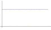
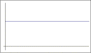
D: The object is moving with a constant velocity.
E: The object is moving with a decreasing velocity.
Answer is: A
Question 20:
This is a graph of the motion of an object.
The X axis represents time, and has a range of 0 to 10
seconds.
The Y axis represents the objectπs velocity, and has a
range of 0 to 10 m/s.

Choose the sentence that is the best interpretation of
the graph:
A: The object is moving with a constant, non-zero
acceleration.
B: The object is moving with an acceleration whose
magnitude is decreasing.
C: The object is moving with an acceleration whose
magnitude is increasing.
D: The object is moving with a constant velocity.
E: The object is moving with an increasing velocity.
Answer is: A
Question 21:
A force is applied to a 1 Kg object according to the
graph below. The object moves
without friction.
The X axis represents time; the range of the X axis is 0
to 2 seconds.
The Y axis represents the applied force; the range of the
Y axis is 0 to 2 Newtons.
Choose the best completion to the following statement:
At 2 seconds, the object
A: is moving with an increasing velocity.
B: is moving with a constant velocity.
C: is moving with a decreasing velocity.
D: is not moving.
E: is moving backwards.
Answer is: B
Question 22:
The following graph represents the current in a simple
circuit consisting of a wire
connecting a battery, a switch, and a resistor.
The X axis represents time; the range of the X axis is 0
to 2 seconds.
The Y axis represents the current in the wire; the range
of the Y axis is 0 to 2 Amps.

Choose the best statement about the graph:
This graph shows
A: the current steadily increasing from 0 to 2 Amps.
B: the current steadily decreasing from 2 to 0 Amps.
C: that the current suddenly changes from 0 to 2 Amps.
D: that the current suddenly changes from 2 to 0 Amps.
E: that the current does not change.
Answer is: C
Question 23:
The following graph represents the position trajectory of
an object traveling with constant speed. The object is moving from a minimum X
value to a maximum X value.
The range of the X axis is 0 to 1 meter.
The range of the Y axis is 0 to 1 meter.
Which statement best describes the acceleration of the
object?
A: The acceleration of the object is 0.
B: The acceleration of the object is parallel to the
direction of travel.
C: The acceleration of the object is perpendicular to the
direction of travel.
Answer is: C
Question 24:
The following graph is for the elastic potential energy
of a material.
The X axis represents the distance that the spring is
compressed.
The Y axis represents the potential energy of the spring.
Choose the sentence that is the best interpretation of
the graph:
A: The elastic potential energy increases as the square
of the distance that the material is compressed.
B: The elastic potential energy is increasing linearly
with the distance the material is compressed.
C: The elastic potential energy is a non-zero constant as
the material is compressed.
D: The elastic potential energy is decreasing.
E: The elastic potential energy of the material is 0.
Answer is: A
Question 25:
The following graph represents an ideal gas in a
container.
The X axis represents volume and has a range of 1 to 10 L3.
The Y axis represents pressure and has a range of 0 to 1
Atm.

Please choose the statement that best describes the
relationship between pressure and volume:
A: The pressure is constant as the volume changes.
B: The pressure is not related to the volume.
C: The pressure increases linearly as the volume
increases.
D: The pressure decreases linearly as the volume
increases.
E: The pressure decreases as 1/volume.
Answer is: E
Question 26:
The following graph refers to the gravitational force
produced by a sphere of mass M, acting on a test object of mass m.
The X axis represents distance, and has a range of 0 to 4
R (R = radius of sphere.)
The Y axis represents the gravitational force, and has a
range of 0 to 1 .
.
Choose the sentence that is the best interpretation of
the graph.
A: The gravitational force first increases as  until
distance = R, then decreases linearly.
until
distance = R, then decreases linearly.
B: The gravitational force first increases as  until
distance = R, then is proportional to
until
distance = R, then is proportional to  .
.
C: The gravitational force first increases linearly until
distance = R, then decreases linearly.
D: The gravitational force first increases linearly until
distance = R, then is proportional to  .
.
E: The gravitational force is not related to the
distance.
Answer is: D
Question 27:
The following graph refers to the electric field produced
by a charged sphere.
The X axis represents distance, and has a range of 0 to 4
R (R = radius of the spherical shell.)
The Y axis represents the electric field, and has a range
of 0 to 1 .
.
Choose the sentence that is the best interpretation of
the graph.
A: The electric field is 0 until distance = R, then
decreases linearly from a maximum value.
B: The electric field is 0 until distance = R, then is
proportional to  .
.
C: The electric field increases linearly until distance =
R, then decreases linearly.
D: The electric field increases linearly until distance =
R, then is proportional to  .
.
E: The electric field is not related to the distance.
Answer is: B
Question 28:
When the ocean depth is greater than three wavelengths,
the speed of waves in the ocean is approximated by the following graph.
The X axis represents the wavelength, and has a range of
0 to 1000 m.
The Y axis represents the velocity of ocean waves, and
has a range of 0 to 40 m/s.
Choose the sentence that is the best interpretation of
the graph.
A: The speed of ocean waves is proportional to the
wavelength.
B: The speed of ocean waves decreases with increasing
wavelength.
C: The speed of ocean waves is proportional to the square
root of the wavelength.
D: The speed of ocean waves is proportional to  .
.
E: The speed is not dependent on the wavelength.
Answer is: C
Question 29:
The following graph shows the trajectory of a projectile
with a constant velocity component in the X direction.
The X axis represents distance, and has a range of 0 to
10 m.
The Y axis represents height, and has a range of 0 to 125
m.
Choose the sentence that is the best interpretation of
the graph.
A: At the graphπs maximum Y value, the magnitude of the
projectileπs velocity component in the Y direction is 0.
B: At the graphπs maximum Y value, the magnitude of the
projectileπs velocity component in the Y direction is greater than 0.
C: Just before the graphπs maximum X value, the magnitude
of the projectileπs velocity component in the Y direction is 0.
D: At the graphπs maximum Y value, the projectileπs
acceleration is 0.
E: At the graphπs maximum Y value, the projectileπs
distance is 0.
Answer is: A
Question 30:
The following graph shows the pattern of light intensity
projected onto a screen from a monochromatic light source.
The X axis represents distance on the screen, and has a
range of -1 to 1 mm.
The Y axis represents relative light intensity, and has a
range of 0 to 1.

This pattern represents light that:
A: has passed through a single slit aperture.
B: has passed through a double slit aperture.
C: has passed through a diffraction grating.
D: is produced by a light beam with a single central
maximum intensity.
E: displays the effects of edge diffraction from a
semi-infinite screen.
Answer is: B
Question 31:
The following graph shows the pattern of light intensity
projected onto a screen from a
monochromatic light source.
The X axis represents distance on the screen, and has a
range of -1 to 1 mm.
The Y axis represents relative light intensity, and has a
range of 0 to 1.

This pattern represents light that:
A: has passed through a single slit aperture.
B: has passed through a double slit aperture.
C: has passed through a diffraction grating.
D: is produced by a light beam with a single central
maximum intensity.
E: displays the effects of edge diffraction from a
semi-infinite screen.
Answer is: D
Question 32:
The following graph shows the light intensity produced by
a black body object, such as the Sun, with a temperature at 5000 K.
The X axis represents the wavelength of light, and has a
range of 0 to 2000 nm.
The Y axis represents relative light intensity, and has a
range of 0 to 1.
Please choose the sentence that best describes the graph.
A: There is a constant distribution of light intensity
vs. wavelength
B: The maximum intensity occurs at approximately 500 nm.
C: The maximum intensity occurs at approximately 1000 nm.
D: The maximum intensity occurs at approximately 1500 nm.
E: The intensity is increasing throughout this range.
Answer is: B
Question 33:
In an AC (alternating current) circuit, the instantaneous
electric power dissipated by a resistor is given in the following graph.
The X axis represents time, and has a range of 0 to  Seconds. Where w
is the frequency of the AC.
Seconds. Where w
is the frequency of the AC.
The Y axis represents power dissipated, and has a range
of 0 to 1 . Emax is the maximum EMF Voltage amplitude.

Please choose the sentence that best describes the graph.
A: The instantaneous power dissipated is a non-zero
constant in time.
B: The instantaneous power dissipated is always
decreasing with time.
C: The instantaneous power dissipated is always
increasing with time.
D: The instantaneous power dissipated is 0 at specific
points in time.
E: The instantaneous power dissipated is always 0.
Answer is: D
Question 34:
A test mass is suspended by springs on a cart. Assume
that the mass of the cart is much greater than that of the test mass. The
following graph describes the motion of the test mass in the Y direction.
The X axis represents time, and has a range of 0 to 10
Seconds.
The Y axis represents distance that the mass has
traveled, and has a range of 0 to 1 m.

Please choose the sentence that best describes the
conditions to produce the motion portrayed in the graph. All velocities are in
the lab rest frame.
A: Only the cart was given an initial velocity in the Y
direction.
B: Only the test mass was given an initial velocity in
the Y direction.
C: The cart was given an initial velocity in the Y
direction while the test mass was given an initial velocity in the - Y
direction.
D: The cart and test mass are given the same initial
velocity in the Y direction.
E: The test mass is given twice the initial velocity of
the cart in the Y direction.
Answer is: E
C.6. Summary Table of Results from the Main Test
Table C.6.1
and Table C.6.2
are summaries of the results obtained from the Main Auditory Graph test. The tables are divided into six
columns: All, Vision, Both, Sound, Blind, and Grad. The All category represents the average of the scores from
the Vision, Both, and Sound groups. Vision represents the subjects given the
test with visually presented graphs, Both represents the group given the test
with both visual and auditory graphs, and Sound represents the subjects given
the test with only auditory graphs.
The Blind group had subjects who were blind and took the test. Only one of these five subjects
answered the Pre-test questions.
The Grad group represents 6 physics graduate students who took the test
with only auditory graphs.
Table C.6.1 Summary of results for the Main Auditory
Graph Test. Part 1.
|
Group
|
All (B, S, V)
|
Visual
|
Both
|
Sound
|
Grad
|
Blind
|
|
# Subjects
|
231
|
76
|
81
|
74
|
6
|
5
|
|
% Female
|
48%
|
41%
|
59%
|
43%
|
17%
|
20%
|
|
Avg Age
|
22
|
22
|
22
|
22
|
29
|
38
|
|
% Correct
Answers:
|
|
|
|
|
|
|
|
Pre-Test
|
|
|
|
|
|
|
|
pt1
|
78%
|
72%
|
83%
|
78%
|
100%
|
20%*
|
|
pt2
|
96%
|
95%
|
96%
|
97%
|
83%
|
20%*
|
|
pt3
|
92%
|
93%
|
89%
|
93%
|
83%
|
20%*
|
|
pt4
|
79%
|
67%
|
81%
|
89%
|
100%
|
20%*
|
|
pt5
|
63%
|
55%
|
68%
|
66%
|
100%
|
20%*
|
|
Main Test
|
|
|
|
|
|
|
|
mt1
|
68%
|
84%
|
64%
|
57%
|
100%
|
100%
|
|
mt2
|
71%
|
86%
|
79%
|
46%
|
83%
|
100%
|
|
mt3
|
80%
|
82%
|
80%
|
77%
|
100%
|
100%
|
|
mt4
|
77%
|
78%
|
79%
|
76%
|
100%
|
100%
|
|
mt5
|
77%
|
80%
|
83%
|
69%
|
100%
|
100%
|
|
mt6
|
42%
|
61%
|
42%
|
24%
|
67%
|
80%
|
|
mt7
|
78%
|
83%
|
81%
|
70%
|
100%
|
100%
|
|
mt8
|
74%
|
76%
|
78%
|
68%
|
100%
|
80%
|
|
mt9
|
60%
|
66%
|
68%
|
45%
|
100%
|
60%
|
|
mt10
|
65%
|
62%
|
75%
|
55%
|
83%
|
80%
|
|
mt11
|
51%
|
58%
|
58%
|
36%
|
100%
|
80%
|
|
mt12
|
30%
|
38%
|
38%
|
14%
|
67%
|
40%
|
|
mt13
|
61%
|
68%
|
65%
|
49%
|
83%
|
80%
|
|
mt14
|
22%
|
28%
|
17%
|
22%
|
83%
|
40%
|
|
mt15
|
63%
|
66%
|
63%
|
59%
|
83%
|
80%
|
|
mt16
|
47%
|
49%
|
46%
|
46%
|
100%
|
80%
|
|
mt17
|
28%
|
30%
|
26%
|
28%
|
100%
|
80%
|
|
mt18
|
49%
|
57%
|
51%
|
41%
|
83%
|
100%
|
|
mt19
|
37%
|
42%
|
35%
|
35%
|
33%
|
60%
|
|
mt20
|
23%
|
21%
|
28%
|
19%
|
83%
|
80%
|
|
mt21
|
36%
|
41%
|
41%
|
26%
|
83%
|
20%
|
|
mt22
|
81%
|
76%
|
81%
|
84%
|
100%
|
100%
|
|
mt23
|
55%
|
62%
|
44%
|
58%
|
50%
|
80%
|
|
mt24
|
71%
|
72%
|
79%
|
62%
|
100%
|
100%
|
|
mt25
|
60%
|
70%
|
62%
|
49%
|
100%
|
100%
|
|
mt26
|
52%
|
58%
|
62%
|
36%
|
100%
|
60%
|
|
mt27
|
59%
|
63%
|
64%
|
50%
|
100%
|
100%
|
|
mt28
|
47%
|
54%
|
58%
|
27%
|
100%
|
100%
|
|
mt29
|
44%
|
54%
|
43%
|
35%
|
83%
|
40%
|
|
mt30
|
49%
|
45%
|
48%
|
54%
|
17%
|
80%
|
|
mt31
|
38%
|
37%
|
36%
|
42%
|
83%
|
60%
|
|
mt32
|
68%
|
72%
|
70%
|
62%
|
100%
|
80%
|
|
mt33
|
69%
|
72%
|
70%
|
64%
|
100%
|
100%
|
|
mt34
|
19%
|
18%
|
16%
|
23%
|
17%
|
0%
|
|
Avg Time (min.)
|
29.37
|
23.56
|
30.72
|
33.86
|
39.74
|
2488.98
|
|
* = only 1 Blind
subject answered the pre-test
|
Table C.6.2 Summary of results for the Main Auditory
Graph Test. Part 2.
|
Avg. # Correct
|
All
|
Visual
|
Both
|
Sound
|
Grad
|
Blind
|
|
Pre-Test
|
4.08
|
3.83
|
4.17
|
4.24
|
4.67
|
1.00*
|
|
Std. Dev.
|
0.65
|
0.86
|
0.52
|
0.63
|
0.46
|
0.00*
|
|
Main Test
|
18.53
|
20.08
|
19.32
|
16.07
|
28.83
|
26.40
|
|
Std. Dev.
|
5.93
|
6.03
|
5.46
|
5.59
|
3.31
|
3.71
|
|
Math Section
|
9.95
|
10.93
|
10.43
|
8.41
|
15.50
|
13.80
|
|
Std. Dev.
|
3.40
|
3.39
|
2.98
|
3.35
|
1.76
|
1.92
|
|
Physics Section
|
8.58
|
9.14
|
8.89
|
7.66
|
13.33
|
12.60
|
|
Std. Dev.
|
3.18
|
3.41
|
3.15
|
2.78
|
1.75
|
2.07
|
|
r = Math/Physics correlation
|
0.31
|
0.27
|
0.44
|
0.17
|
0.31
|
0.27
|
|
Split Half Reliability
|
0.47
|
0.43
|
0.61
|
0.29
|
0.47
|
0.42
|
|
|
Average
|
# Subjects
|
|
|
|
|
|
Sound with Music Trianing
|
16.91
|
47
|
|
|
|
|
|
Sound w/o Music Trianing
|
14.59
|
27
|
|
|
|
|
|
|
|
|
|
|
|
|
|
* = only 1 Blind subject answered the pre-test
|
|
|
|
|
|
|
|
|
|
C.7. Histograms and Tests of Normal Distribution of Data
In Chapter 9, the data were assumed to follow a normal
distribution so that t-tests could be
applied. The following charts show
that the data is a fair, but not perfect approximation to the ideal Normal
population distribution. In this test, there seems to be a few more outlying
data points than would normally be expected. Appendix B.7 has a discussion on the techniques used for the
Normal Probability graphs.
Figure
C.7.1
portrays a histogram of the distribution of scores on the Main test. The distribution closely, but not
perfectly follows the Gaussian ideal. These results are greatly improved over
those of the Web Pilot Test. 0
displays the Normal Probability plot of the distribution. As can be readily seen, the slope of
the best fit (0.20) is not in perfect agreement with the  slope of the
predicted ideal. A normal
population would have a 0.20 slope if the sample size were 25 rather than the
231 used in this study. Separating
the subject groups showed similar results.
slope of the
predicted ideal. A normal
population would have a 0.20 slope if the sample size were 25 rather than the
231 used in this study. Separating
the subject groups showed similar results.
Thus, the data does not follow a perfect normal population
distribution which may introduce some inconsistent results in the tests applied
in Chapter 9. However, it should be noted that the data is not radically
different from a normal population, so the general analysis should be
satisfactory.
Appendix D Material Relating to the Auditory Preference Pilot Test
D.1. Overview
This appendix contains material used in the Auditory
Preference Pilot test. These materials include the Introductory page, Informed
Consent form, and the question pages.
There is also a summary of the results obtained from this test as well
as a listing of the subjectπs text responses for each of the questions.
D.2. Introductory page and Informed Consent Form
Welcome
The object of this test is to compare preferences between
different types of auditory representations of graphical information. Two types
of graphs are utilized, pictorial graphs which almost everyone is familiar
with, and sonified data graphs (data represented by sound), which is much less
common.
In general, the Y axis of the pictured graph will be
represented by pitch and the X axis by time. Additionally, some of the auditory
graphs may contain characteristics relating to first and second derivative
values as well as negative quantities.
As this is a test about preferences, many questions do not
have a right or wrong answer, simply respond as to which choice seems to work
best.
To listen to the graphs when they are presented, click on the
button marked ≥Play≤ next to the answer choice. You can play a graph as many
times as you like. Answers will be of a multiple-choice format, with a text
area for additional comments.
Hardware and software requirements for this test are a sound
capable computer, Windows95, and Internet Explorer 4.0 or greater. Some of the
sounds used in this test utilize Microsoftπs ActiveX controls. Due to the
nature of these controls, some pages may take a minute or two to load. Please
be patient.
Since some of the ActiveX controls are not registered, the
View -> Internet Options -> Security setting will need to be set to Low.
Neither Oregon State University, nor the investigators assume any
responsibility for the actions of these controls. Use at your own risk.
Before proceeding, please take a moment to read the following
document.
Statement of Informed Consent
Physics Department, Oregon State University
Title of Project: Comparison Between Auditory and Visual
Graphing Methods.
Investigators:
Steven Sahyun, Graduate Research Assistant, Physics Department.
John Gardner, Professor, Physics Department.
This purpose of this study, as stated above, is to determine
preferences between auditory graphing (data representation using sound)
methods.
How the test will work:
Subjects will be given a log-in page that records their name.
Names are not stored the same computer file as responses.
Subjects will then be given a series of 9 pages containing
questions in multiple-choice and Likert scale preference formats. Also, some
questions will ask for identification of displayed graphs.
Only data from subjects who answer all 9 question pages will
be used.
It should be noted that all responses are being transferred
on the Internet, and are not encrypted. However, reasonable attempts at
confidentiality are made in that the subjectπs name will not appear with, or be
stored with, any of their responses. Names will not be used in any publications
or presentations of the data obtained.
It should also be noted that in cases where student subjects
are taking this test for extra credit in a course, a list of which students
have taken the test will be forwarded to the respective schoolπs instructor so
that those subjects may receive credit. Results of the study will not be used
to determine credit, only the fact that the test has been taken. Also, a
summary listing of the average responses to the test questions will be
available to the instructor.
The test is estimated to take about 10 minutes.
Participation in this study is voluntary and you may either
refuse to participate or withdraw from the study at any time, although full
participation is greatly appreciated. You may take a break at any time, just be
sure not to loose the web page question that you are on. If there should be a
technical problem (crash) during the test, you will need to start over.
If you have any questions about the research study and/or
specific procedures, please contact:
Steven Sahyun
Physics Department
Oregon State University
301 Weniger Hall
Corvallis OR, 97330
USA
The phone number is (541) 737-1712. Any other questions
should be directed to Mary Nunn, Sponsored Programs Officer, OSU Research
Office, Oregon State University, Corvallis, OR, 97331. The phone number is:
(541) 737-0670.
After reviewing the above statement, please click on the link
below:
I agree to this test.
Questions about this test? Send me e-mail:
sahyuns@ucs.orst.edu
Last modified November 10, 1998.
D.3. Test Questions
The questions used in the Auditory Preference Pilot Test
were displayed as a series of 9 Web pages. Each question displayed a series of choices with radio style
button selectors, as well as a text entry field so that they could record
comments relating to their choice selection. Figure
D.3.1
demonstrates a typical question. The text of the different questions, as well
as an explanation of which sound graphs were being compared follows the figure.
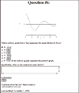
Figure D.3.1. Typical Question Layout for the Auditory
Preference Pilot Test
Question #1:

Which of the auditory graphs below, if any, do you prefer
as best matching the graph displayed above?
In these auditory graphs, the y axis is represented by
pitch and the x axis with time.
ƒA: Play
ƒB: Play
ƒC: Both represent the graph equally well.
ƒD: Neither represents the graph well.
Specifically, what are the reasons for your choice?
Next Question
Clear
Comment on Question 1:
This question compared two Auditory representations of a
Gaussian curve using only pitch to represent the curve. Choice A used an ActiveX control
producing a smooth, continuously varying tone, while Choice B used the MIDI piano
instrument with notes representing data points. This question was intended to check how many people
preferred the smooth tone versus the more staccato sounding MIDI.
Question 2 used the same graph as in question 1, but the
text read as:
In the auditory graphs below, the y axis is represented by
the pitch of the piano tone, and the x axis is represented by time.
Additionally, the first derivative (slope) is represented by the frequency of a
drum beat. The second derivative (curvature) is represented by the pitch of the
drum beat.
Which auditory graph do you prefer as best matching the
graph displayed above?
ƒA: Play
ƒB: Play
ƒC: Both represent the graph equally well.
ƒD: Neither represents the graph well.
Specifically, what are the reasons for your choice?
Next Question
Clear
Comment on question 2:
This question compared two MIDI graphs, where the difference
was the pitch of a tick mark (drum-beat) representing the first (slope) and
second (curvature) derivatives.
Choice A used the mapping of a low tone for the tick mark pitch when the
curvature was positive, and a high tone when it was negative. Choice B used the reverse mapping in
that the positive curvature had a high pitch tone and negative had a low pitch.
Question #3:

In the
auditory graphs below, the y axis is represented as pitch and the x axis as
time.
Which auditory graph do you prefer as best matching the
graph displayed above?
ƒA: Play
ƒB: Play
ƒC: Both represent the graph equally well.
ƒD: Neither represents the graph well.
Specifically, what are the reasons for your choice?
Next Question
Clear
Comment on Question 3:
This question used two MIDI auditory graphs to determine it
there was a preference for indicating when the graphπs y axis values were
negative. Choice B had an
instrument change from piano to harpsichord for negative values, while Choice A
had no change.
Question 4 had the same graph and similar wording to
question 3, but compared subjectsπ preference for the ActiveX smooth tone and
tick mark beats having high pitch for positive values and low pitch for
negative values (Choice A) to a MIDI graph with drum-beats (high pitch for
negative values, low pitch for positive ones) and an instrument change for
negative y axis values (Choice B). A change in the tone quality
representing negative y axis
values was not used with the ActiveX graph as this feature was not available at
the time of testing.
Question #5:
Which auditory graph below best represents the graph
displayed above?
ƒA: Play
ƒB: Play
ƒC: Play
ƒD: Play
ƒE: Play
ƒF: None of the choices represent the displayed picture.
Specifically, what are the reasons for your choice?
Next Question
Clear
Comments on question 5:
This question was intended to determine how effectively
subjects could match a visually presented graph to an ActiveX graph with the
tick mark beats having high pitch for positive values and low pitch for
negative values. The five graph
choices were representations of (A) sin x,
(B) cos x, (C) x sin x,
(D) e-x sin x , and (E) e-x cos x.
Question #6:
Which auditory graph below best represents the graph
displayed above?
ƒA: Play
ƒB: Play
ƒC: Play
ƒD: Play
ƒE: Play
ƒF: None of the auditory graphs represent the pictured
graph.
Specifically, what are the reasons for your choice?
Next Question
Clear
Comments on question 6:
This question was similar to question 5, except that it used
MIDI auditory graphs and the pitch of the drum was high for negative curvature
and low for positive curvature.
The five graph choices were representations of (A) sin x , (B) cos x, (C) x sin x, (D) e≠x sin x, and (E) e-x cos x. The point of questions 5 and 6 was to
compare the two auditory methods for subjectsπ ability to correctly match a
visual graph to one of several auditory graphs.
Question #7:
Play
Which graph pictured below best represents the auditory
graph above?
|
ƒA:
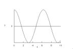
|
ƒB:
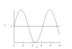
|
|
ƒC:
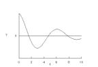
|
ƒD:
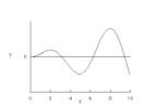
|
|
ƒE:
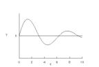
|
ƒF: None of the pictured choices represent the sound.
|
Specifically, what are the reasons for your choice?
Next Question
Clear
Comments on question 7:
Question 7 was similar to those of 5 and 6, however, in this
question, the subject was asked to match an ActiveX auditory plot of cos x with derivative tick-mark beats (high pitch for
positive values and low pitch for negative values) to one of the five visually
presented graphs.
Question #8:
Question 8 was presented identically to question 7. The auditory graph for this question
was a MIDI representation of sin x with
derivative (high for negative curvature and low for positive curvature) and an
instrument change for negative values. The point of questions 7 and 8 was to
compare the two auditory methods for subjectsπ ability to correctly match an
auditory graph to one of several visual graphs.
Question #9:
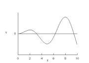
The following auditory graphs represent the graph
pictured above. For each of the auditory graphs below, please give a rating on
how well you feel that the sound graph represents the graph pictured above.
The scale is 1 to 5, where 1 is bad, 2 is poor, 3 is
neutral, 4 is good, and 5 great.
A: ƒ1 ƒ2 ƒ3 ƒ4 ƒ5 Play
B: ƒ1 ƒ2 ƒ3 ƒ4 ƒ5 Play
C: ƒ1 ƒ2 ƒ3 ƒ4 ƒ5 Play
D: ƒ1 ƒ2 ƒ3 ƒ4 ƒ5 Play
E: ƒ1 ƒ2 ƒ3 ƒ4 ƒ5 Play
F: ƒ1 ƒ2 ƒ3 ƒ4 ƒ5 Play
Specifically, what are the reasons for your choices?
End
Clear
Comments on question 9:
This last question was designed to find subjectsπ overall
preference for the different auditory graphing methods that were used. This question allowed subjects to
indicate which method was their overall preference and how well they felt that
the auditory graphs acted as a display method.
D.4. Summary of the Results from the Auditory Preference
Pilot Test
Table D.4.1 lists the results from the test questions.
Tables D.4..2-10 list subject text responses.
Table D.4.1 . Summary of Results from the Auditory Prefernce
Pilot Test.
|
Total #
|
12
|
|
|
|
|
|
|
|
A
|
B
|
C
|
D
|
E
|
F
|
|
1. Gaussian curve, A = ActiveX, B=MIDI, C=both, D=neither
|
33%
|
58%
|
8%
|
0%
|
|
|
|
2. Gaussian curve, drum beat for deriv, pitch for second
deriv, A=low +, high -; B = high +, low -, C = both good, D=neither good
|
33%
|
17%
|
33%
|
17%
|
|
|
|
3. x sinx. A=no change at 0, B= instrument change at 0, C
both good, D neither good
|
50%
|
42%
|
0%
|
8%
|
|
|
|
4. x sinx. A=ActiveX with deriv., B=MIDI with deriv and
pitch change a 0; C = both, D=neither
|
33%
|
50%
|
0%
|
17%
|
|
|
|
5. Match e ≠x sin x, graph
(d), ActiveX sounds. a= sin x,
b= cos x,, c= x sin x,
d= e ≠x sin x,, e= e ≠x cos x, f=none
|
17%
|
0%
|
17%
|
58%
|
0%
|
8%
|
|
6. Match e ≠x cos x, graph
(e), MIDI sounds. a=sin x,
b=cos x, c=x sin x,
d= e ≠x sin x,, e= e ≠x cos x,, f=none
|
8%
|
0%
|
0%
|
17%
|
58%
|
17%
|
|
7. Match ActiveX sound of cox(x) to picture graph (a). a=cos x, b=sin x, c=x sin x,
d= e ≠x cos x,, e= e ≠x sin x, f=none
|
75%
|
0%
|
0%
|
17%
|
8%
|
0%
|
|
8. Match MIDI sound of sin(x) to picture graph (b). a=cos x, b=sin x, c=xsin(x),
d= e ≠x cos x,, e= e ≠x sin x,, f=none
|
0%
|
92%
|
0%
|
0%
|
0%
|
8%
|
|
9. Likert preference of xsin(x) graph with different sound
represntations 1- 5,
1 is bad, 2 is poor, 3 is neutral, 4 is good, and 5 great.
|
|
|
|
|
Average
|
Std. Dev.
|
|
|
|
|
|
a. MIDI
|
3.75
|
0.87
|
|
|
|
|
|
b. ActiveX
|
3.75
|
1.14
|
|
|
|
|
|
c. MIDI, dx
|
3.08
|
0.79
|
|
|
|
|
|
d.ActiveX, dx
|
3.42
|
1.08
|
|
|
|
|
|
e. MIDI, 0
|
3.83
|
1.34
|
|
|
|
|
|
f. MIDI, dx, 0
|
3.33
|
1.44
|
|
|
|
|
|
Average a-f:
|
3.53
|
1.11
|
|
|
|
|
|
|
|
|
|
|
|
|
|
Table D.4.2 . Text responses for Question 1.
|
Subject
|
Comment
|
|
35
|
I was more familiar with sound A as a representative of
motion going up and down.
|
|
36
|
It was harder for me to picture the second part of the
curve with A. B just seemed
clearer.
|
|
40
|
I seem to make the connection better for the higher pitches
|
|
41
|
The greater difference between the maximum and minimum
tones made the graph easier to visualize
|
|
42
|
Sound A was a continuous sound, and was difficult for me to
hear the steepness of the graph.
Sound B seemed to help in this instance, but still needed more
discontinued sounds. Also, with sound A, it was difficult to distinquish when
it was at the top of the graph.
I heard it better in B.
|
|
44
|
A sounded more continuous
|
|
46
|
B is like to going up the hill and seems that a car has
going up to a hill and gives more gas.
|
|
47
|
Selection A was less dramatic than B.
|
|
48
|
It sounds more gradual and note quite as steep as the other
|
|
49
|
Both the sounds seemed rise and fall about how the visual
graph. The only real difference
was that they had different time scales.
|
Table D.4.3 . Text responses for Question 2.
|
Subject
|
Answer
|
Comment
|
|
35
|
C
|
I had a hard time listening and interpreting the drum beats
when they were at a low pitch. I
wasnπt really sure of the frequency, however, I chose C because the piano and
high pitch drum beat were representative of the graph for both A and B.
|
|
40
|
A
|
b is very confusing
|
|
41
|
C
|
neither changed my perception of the graph much
|
|
42
|
D
|
I actually had a hard time first distinquishing the
difference between the two sounds, then I did not think either one
represented the graph. The pitch
of the piano tone did not seem to be as drastic as the graph previously.
|
|
44
|
D
|
The beats were confusing, if they could represent time
intervals, they may be more useful.
|
|
46
|
C
|
However, they need a little bit dramatical sound when they
reached at the top of the graph, I think.
|
|
47
|
A
|
The high pitch at the top of the curve best described the
peak of the curve.
|
|
48
|
B
|
I could hear the first/second derivatives better in this
one
|
|
49
|
B
|
The freqency of the drum seemed to match what I would
expect for the dirivative.
|
Table D.4.4 . Text responses for Question 3
|
Subject
|
Answer
|
Comment
|
|
35
|
B
|
I liked how the pitch changed when the graph went below
0. I think it is important to
change the sound when some major distinction (like the zero line) is
involved.
|
|
36
|
B
|
I liked hearing the differece between positive and
negative.
|
|
40
|
A
|
b involves too many options for the ear to play with. I did not feel that I needed a
different sound for negative values.
|
|
41
|
A
|
The change from something sounding like a piano to
something like an harpsichord broke up the graph a little too much
|
|
42
|
A
|
I wasn;t sure, but sound B seemed like it went down in
volume as the graph decreased. OTher than that, they sounded the same.
|
|
44
|
D
|
Although A represented it more closely, the intervals for
the maxima didnπt seem to agree with the sound
|
|
46
|
B
|
B expressed better on the ups and downs. The sound of downs
is easily recognized, but that of ups is little bit.
|
|
47
|
B
|
The change in sound when the curve went into negative
values was very helpful.
|
|
48
|
B
|
Definitely because the change as you cross into negative,
very helpful
|
|
49
|
A
|
Although both seem to discribe the graph correctly, I
didnπt like to sound when the function went negative.
|
Table D.4.5 . Text responses for Question 4.
|
Subject
|
Answer
|
Comment
|
|
35
|
B
|
The distinct sounds in B were much more clear than in
A. In fact I think I just
started to learn how to interpret the drum beats.
|
|
36
|
B
|
With A I couldnπt hear a lot of the drum. It may be something I could learn to
listen for with enough use but one first listen, I thought B was more clear.
|
|
40
|
A
|
a would be better if the drum pitch had those high
harmonics for positive values instead of the negative ones.
|
|
41
|
D
|
too much information at once
|
|
42
|
B
|
In sound B, the slopes were more apparent, however, I think
there needs to be more drum beats (lacking in A) Also, doesnπt the time and change in pitch indicate the
slope of the curve? The drum
beats really don;t seem to help me.
|
|
44
|
A
|
dipicted amplitude and interval the best
|
|
46
|
A
|
A sound is good to me. I recognized that piano and drum
beat are little bit hard to make a picture in my mind. Sharp pitch is better
to me, but this one also needs some different sound to express the ups and
downs.
|
|
47
|
B
|
Te combination of the negative value change in sound and
the high pitch at the peak of the curve.
|
|
48
|
B
|
this agin, for negative change and you can pick up the
slope/curvature better
|
|
49
|
D
|
Both seemed rather arbitrary in relation to the graph, at
least in the dirivative department.
|
Table D.4.6 . Text responses for Question 5.
|
Subject
|
Answer
|
Comment
|
|
35
|
F
|
I started to
choose E or D, but really I didnπt like any of the choices. I thought that the pitch did not go
high enough at the beginning of the graph or was not low enought at the end
of the graph. Also, the long drawn out sound at the end created a sen
|
|
36
|
D
|
With D, I found
it easier to distinguish the X ad Y (the legnth vs. the height of the
curve). B and E I would have had
reversed around the y axis. A I would not have pictured both curves about the
same size.
|
|
41
|
D
|
sounded the
closest
|
|
42
|
C
|
B and E sounded
the opposite of what the graph illustrated (if a higher pitch is up, lower
down) I just like the sound of C the best, however, listening to the pitches,
it almost seems like the two maximums reach the same pitch, but on the graph,
the second one is lower.
|
|
46
|
D
|
D sound
represent the distance as time goes.
|
|
47
|
D
|
The change in
sound as the curve went into the negative region of the y- axis.
|
|
48
|
D
|
But frankly,
a-d sounded all the same
|
|
49
|
C
|
I think that
A,C, and D seemed to do the graph justice but I think that C was the most
clear
|
Table D.4.7 . Text responses for Question 6.
|
Subject
|
Answer
|
Comment
|
|
35
|
E
|
E was the only one I could trace mentally on the graph.
|
|
36
|
E
|
B, C, and D sounded upside down. E was the clearest.
A had too much to listen to.
|
|
41
|
D
|
sounded closest although the drums in the background
created confusion as to what was going on there
|
|
42
|
A
|
B,c,d sounded opposite to the graph and A and E sounded
nearly the same.
|
|
46
|
E
|
Among them, E is the best, but I think if not considering
emotion of people, drum and piano sound are hardly recognized by distance and
ups and downs.
|
|
47
|
D
|
The tempo of the drum was most clear in describing the
slope of the line, as was the the change in sound describing the negative
values ofthe curve.
|
|
48
|
E
|
sounded not as choppy, not so harsh on the change over to
negative
|
|
49
|
F
|
E seemed the closest, but the dirrivative portion seemed
wrong.
|
Table D.4.8 . Text Responses for Question 7.
|
Subject
|
Answer
|
Comment
|
|
35
|
A
|
It whining sound was well represented both up and
down. The drum beats added
something that I could also verify my choice with.
|
|
36
|
A
|
It sounded like it started high, went down and raised just
as high before going just as low down ad then having a slight upturn at the
end.
|
|
42
|
A
|
The time between the minimums and maximums sounded equally
apart.
|
|
46
|
D
|
I thought sharp sound would be better drum and piano sound,
but in this question sharp sound do not well represent the starting point. I
mean in C and D I cannot really identify the starting sound.
|
|
47
|
D
|
The pitch started high and progressively got lower. As the
curve passed into the negative I heard the distinct sound. The duration of
the sound also lent itself to curve D.
|
|
48
|
A
|
Because the min/max sounded the same pitch
|
|
49
|
A
|
Its the only one that seemed to fit, right down to the bit
of the next period.
|
Table D.4.9 . Text Responses for Question 8.
|
Subject
|
Comment
|
|
35
|
I could hear the piano pitch go up and down and I listened
to see if the pitch both times was equal. It seemed equal to me, so I picked B.
|
|
36
|
Went high, low, high, low with drums concentrated at the
shifts from high to low.
|
|
42
|
I was going by the time between the original incline, to
the dip and the incline again.
|
|
46
|
Drum and piano sound have a good effect to represent the
ups and downs. If we know about which sound (drum or piano) is for ups or
downs, I think I can identify these graphs.
|
|
47
|
Symmetrical pitch and rate for both sides of the curve.
|
|
48
|
Because of the apparant high rise in the beginning
|
|
49
|
That seemed to mostly fit B, but I donπt think the
derivative was correct.
|
Table D.4.10 . Text Responses for Question 9.
|
Subject
|
Comment
|
|
35
|
By this time, I have a better understanding of how the
sounds work together. They all represented the graph well, it just depended
on if one was interested in slope and curvature. I think the person taking this test shoud get some warm up
graphs to under
|
|
36
|
I like hearig positive and negative. I like having pauses between notes
instead of one constant sound. I
like really hearing the slope. I
donπt like the soft drums because itπs hard to differentiate them from the
sound of the computer loading.
|
|
40
|
a is simple and pleasing to the ear. d is good and contains more
information than (a) and would be easy to understand with limited
explanation.
|
|
42
|
A:it went really slow, B:the sound was a bit annoying, but
like the pace, C:I am starting to find the drum beats to be annoying, D:had
an annoying pitch along with the drum beats. E:I am starting to like the
discrete noises of the piano over time without the drum beats. This still may have been to slow, but
I liked it the best, F:Drum beats and slow.
|
|
47
|
E and F were the best because they told you when the curve
went into the negative region of the y-axis.
|
|
48
|
Again, I really like the negative value changing tone. It really helped to see the graph
with my eyes closed
|
|
49
|
The drum used to specify the derivatives in C and F I think
are rather hard to identify.
|
Appendix E C++ code for the DataReader program
The C++ code in this appendix relates to the DataReader
program which read in an x, y data set file, converted the data to a chromatic
scale, added drum beats, and changed the instrument for negative values. It then wrote the converted data to an
SLG text file. There are two files, the first is the DataPane header file, and
the second is the DataReader program.
E.1. DataPane.h
//© 1997 Steven Sahyun 9/22/97
//DataPane.h
#pragma once
#include <LPane.h>
#include <LCommander.h>
class
DataPane : public LPane, public LCommander
{
public:
DataPane( LStream *inStream );
static DataPane* CreateDataPaneStream( LStream *inStream );
// static void WriteData( int max, float *xptr,
float *yptr );
private:
double x[500];
double y[500];
int i, maxvalue;
char fileName[64];
double dataarray[1000];
double *dataarray_ptr;
protected:
virtual void DrawSelf( void );
virtual void ClickSelf( const SMouseDownEvent &inMouseDown );
//virtual void SaveSelf(void);
};
E.2. Data Reader.cp
// © 1997 Steven Sahyun 9/22/97 Oregon State University
// sahyuns@ucs.orst.edu
// This code may be used with written permission from the
author
// for non-commercial applications.
// written for CodeWarrior Pro 3 compiler
//DataPane.cp
#include ≥DataPane.h≤
#include <fstream.h>
#include <string.h>
#include <ctype.h>
#include <iomanip.h>
//prototype
void itoa(int n, char s[]);
void ftoa(float n, char s[]);
void reverse(char s[]);
void convertPascalStr (Str63, char *);
void StandardPutFile (Str255 prompt, Str255 defaultName,
StandardFileReply *replyPtr);
#define StandardPutFile
char *pitch( int maxvalue, double yvalue, double
*yarray_ptr);
float ReadData(double *dataarray, char fileName[64]);
float WriteData(double *dataarray);
typedef char Str25[26];
typedef char Str250[251];
// =========================================================
//
create a DataPane pane from a PPob resource
DataPane*
DataPane :: CreateDataPaneStream( LStream *inStream )
{
return ( new DataPane( inStream ) );
}
// =========================================================
//
respond to a mouse click on the pane
void
DataPane :: ClickSelf(const SMouseDownEvent &)
{
//temporary solution until I figure out how to access the
data from a
//protected class
// really want this in the cmd_Save section of
DataReaderPP.cp
dataarray_ptr
= &dataarray[0];
WriteData(dataarray_ptr);
}
//
=========================================================
//
the construct-from-stream constructor
DataPane :: DataPane( LStream *inStream ) : LPane( inStream )
{
dataarray_ptr
= &dataarray[0];
//get file name here so that it will be part of the
datapane object
//choose the file to read in
// Data structures and variables for call to
StandardGetFile
StandardFileReply
replyStruct;
SFTypeList
typeList; // weπre going to allow all file types
short
numTypes = -1; // allow all types of files
StandardGetFile
(nil, numTypes, typeList, &replyStruct);
if
(!replyStruct.sfGood)
return;
// user cancelled but continue anyway
convertPascalStr
(replyStruct.sfFile.name, fileName);
ReadData(
dataarray_ptr, fileName);
//load
data into objectπs x, y array
maxvalue
= *(dataarray_ptr++);
for
(i=0; i<maxvalue; i++)
{
x[i]
= *(dataarray_ptr++);
}
for
(i=0; i<maxvalue; i++)
{
y[i]
= *(dataarray_ptr++);
}
}
//
=========================================================
//
draw the paneπs frame and contents
void
DataPane :: DrawSelf( void )
{
//Display the data
::TextFont( systemFont );
::TextSize( 12 );
i = 0;
Str250
textstring;
Str25
numberstring;
unsigned
char *text;
MoveTo
( 10,20);
strcpy
(textstring, ≥This is Data Set: ≥);
strcat
(textstring, fileName);
text = c2pstr (textstring); //convert C string to a
pascal string
//so can write in window
DrawString(
text );
for
(i=0; i< maxvalue; i++)
{
//generate x string to write to window, this is a bit
cumbersome
MoveTo
( 5, i*12 + 35);
strcpy
(textstring, ≥ x[≥);
itoa
(i, numberstring);
strcat
(textstring, numberstring);
strcat
(textstring, ≥]: ≥);
ftoa
(x[i], numberstring);
strcat
(textstring, numberstring);
text
= c2pstr (textstring); //convert C string //to a pascal string so can write in
window
DrawString(
text );
//generate y string to write to window, this is a bit
cumbersome
MoveTo
( 100, i*12 + 35);
strcpy
(textstring, ≥ y[≥);
itoa
(i, numberstring);
strcat
(textstring, numberstring);
strcat
(textstring, ≥]: ≥);
ftoa
(y[i], numberstring);
strcat
(textstring, numberstring);
text
= c2pstr (textstring); //convert C string to a pascal //string so can write in
window
DrawString(
text );
}
}
//=======================================================
// functions
//this is a function used in getting the file information
void convertPascalStr (Str63 Pascalstring, char *
Cstring)
{
int
length;
int
i;
length
= Pascalstring[0]; // get length byte
for
(i = 0; i < length; i++)
Cstring[i]
= Pascalstring[i+1];
Cstring[i]
= å\0π; // donπt forget the terminating null
}
// reverse: to reverse string s in place; goes with itoa,
K&R p. 62
void reverse(char s[])
{
int
c, i, j;
for
(i = 0, j = strlen(s)-1; i<j; i++, j--)
{
c
= s[i];
s[i]
= s[j];
s[j]
= c;
}
}
// FTOA: convert n to characters in string K&R p. 64
void ftoa(float nflo, char s[])
{
int
i, sign;
int
n;
i
= 0;
nflo
*= 100;// look at only 2 places past decimal
n
= (int) nflo; // chop off rest
if
((sign = n) < 0) // record sign
n
= -n; // make
positive
while
(i < 2)
{
s[i++]
= n % 10 + å0π;
n
/= 10;
}
s[i++]
= å.π; //
decimal point
do
{ //
generate digits in reverse order
s[i++]
= n % 10 + å0π; // get next digit
}
while
(( n /= 10) > 0); //
delete it
if
(sign < 0)
s[i++] = å-π;
s[i]
= å\0π;
reverse(s);
}
// ITOA: convert n to characters in string K&R p. 64
void itoa(int n, char s[])
{
int
i, sign;
if
((sign = n) < 0) // record sign
n
= -n; //
make positive
i
= 0;
do {
// generate digits in reverse order
s[i++] = n % 10 + å0π; //
get next digit
}
while (( n /= 10) > 0); //
delete it
if
(sign < 0)
s[i++] = å-π;
s[i]
= å\0π;
reverse(s);
}
// Reading Data from a file
//this reads x y data from a given file and puts it into
a single array.
//It returns a pointer to the array.
//the array sructure is # of items in array, x data, y
data.
float ReadData(double *dataarray, char fileName[64])
{
//get
data here
float
result = 0, *result_ptr = &result;
//float
dataarray[1000], *dataarray_ptr;
double
x[500], y[500];
int
i, maxvalue;
ifstream
fin (fileName);
if
(!fin)
return
*dataarray;
//read
the data here
i
= 0;
while
(!fin.fail())
{
fin
>> x[i] >> y[i];
i++;
}
fin.close();
maxvalue
= i;
dataarray[0] = maxvalue - 1; //
Data Array 0
1 2 .... n //n+1 n+2 ... 2n
for (i=1; i<maxvalue; i++) // value max x0 x1 ... xn-1
//y0 y1 ... y2n-2
{
dataarray[i]
= x[i-1];
}
for
(i= 0; i<maxvalue; i++)
{
dataarray[i+
maxvalue] = y[i];
}
return
*dataarray;
}
// Writing Data to a file
float WriteData (double *dataarray)
{
double
x[500], y[500];
//char
fileName[64];
int
i, maxvalue;
//load
data into x, y arrays
maxvalue
= *(dataarray++);
for
(i=0; i<maxvalue; i++)
{
x[i]
= *(dataarray++);
}
for
(i=0; i<maxvalue; i++)
{
y[i]
= *(dataarray++);
}
Str255 prompt = ≥\pSave file as:≤; // \p tells the
compiler to
//make a Pascal string
Str255
default_name = ≥\pData.slg≤;
StandardFileReply
replyStruct;
StandardPutFile
(prompt, default_name, &replyStruct);
// if
(!replyStruct.sfGood)
// return
*dataarray; // user cancelled; donπt save
// trying to put a name for the data set; for some reason
the save dlg
//isnπt working
//convertPascalStr (replyStruct.sfFile.name, fileName);
ofstream
fout (≥Data.slg≤); //ofstream fout (fileName);
// if
(!fout)
// return
*dataarray;
//this section converts the data and outputs it in SLG
text MIDI format
int bar, beat, durbeat;
int
beatpart, durbeatpart, TIMEBASE = 100;
float
temp;
float
maxx = 0;
float
maxy = 0, yold = y[0];
float
slope1, slope2;
float
curvature;
float
minx = 9999999;
float
miny = 9999999;
float
zeropoint = 0; // in case of negative y values
int
instrument = 4; //electric piano - works well as sound does //not decay
int
neginstrument = 6; //harpsichord - for negative values
int
ytickinstrument = 47; //melodic tom - seemed to work best for //sound as is
short
// c2 for - curve, c3 for no curvature, c4 for + curve
char
*note; //pointer to start of the note array value for the x //data set
char dnote[4]; // ≥≥ for the derivativeπs data set
//data is loaded into functionπs array here, x is for
time, y is for //pitch
for (i = 0; i < maxvalue; i++)
{
temp = x[i];
if (maxx < temp)
maxx = temp;
if (minx > temp)
minx = temp;
temp = y[i];
if (maxy < temp)
maxy = temp;
if (miny > temp)
miny = temp;
}
// deal with negative y values by y = y+abs(minimum y),
then do a //program change piano/harpsicord around y = abs(min y)
if (miny < 0)
{
for (i = 0; i<maxvalue; i++)
{
y[i] -= miny; // subtract a negative = shift data set
//into positive //territory
}
zeropoint -= miny; //want to set the new 0
maxy -= miny; //shift max and min values by min value
miny -= miny;
}
//header, uses timebase of 100 for easy calculations
fout << ≥%MIDIFILE\n@MThd\n@FORMAT 0\n@TIMEBASE
≥<<TIMEBASE<<≥\n@END\n≤;
fout <<
≥;---------------------------------------\n@MTrk 1\n≤;
//instrument is written here
if (y[0] >= zeropoint )
fout << ≥001|1|000 1:PROG ≥
<< instrument << ≥\n≤; //main
data //tone on midi chan 1
else
fout << ≥001|1|000 1:PROG ≥
<< neginstrument << ≥\n≤;
//if first point is negative switch to negative
instrument
fout << ≥001|1|000 2:PROG ≥
<< ytickinstrument << ≥\n≤; //dx/dy info on midi chan 2
fout << setiosflags (ios::fixed | ios :: right)
<< setprecision(0) << setfill(å0π); // make the output look pretty
// sound is written here, convert into SLG format for
times and pitch
// initial slope beat at start
//checking the curvature
slope2 = (y[1] - y[0])/(x[1] - x[0]);
curvature = slope2;
//may need to put an if statement here limiting
sensitivity
if
(curvature > 0)
//positive curvature dy2/dx2 > 0; //concave; lower //value, like
water in a bowl
strcpy (dnote, ≥C3≤);
else if (curvature < 0) //negative curvature dy2/dx2 < 0; //convex,
//higher value, like water hitting a hat
strcpy (dnote, ≥C5≤);
else
strcpy (dnote, ≥C4≤); //line; no curvature
//write the beat info here
fout << ≥001|1|000 2:≤ << dnote << ≥ 127
0|020\n≤;
//data notes and beat notes
for (i = 0; i < maxvalue; i++)
{
//sets the duration of the note;
if (i+1 == maxvalue) //need to worry about last data point
{
durbeatpart = (int) (2000*(x[i] - x[i-1])/(maxx -
minx))%TIMEBASE;//2000 is the total time, Timebase is for
the beatpart
durbeat = (int) (20*(x[i]- x[i-1])/(maxx - minx))%4;
}
else
{
durbeatpart = (int) (2000*(x[i+1] - x[i])/(maxx -
minx))%TIMEBASE;//2000 is related to the total time, Timebase
is for the
beatpart and is same as timebase
durbeat = (int) (20*(x[i+1]- x[i])/(maxx - minx))%4;
}
beat = (int) (2000*(x[i]- minx)/(maxx -
minx))%(4*TIMEBASE); // for intervals less than a beat,
//each beat has 4 parts
beatpart = beat%100; //kludge because I couldnπt figure
out //how to //add this in the previous line
beat = (int) (20*(x[i]- minx)/(maxx - minx))%4 + 1;
bar = (int) 20*(x[i] - minx)/(maxx - minx)/4 + 1;
note = pitch( maxvalue, y[i], &y[0]); //put the
values of //the returned pitch pointer value into note pointer
// check to see if crossed zeropoint, if so change
instrument.
if (y[i] <= zeropoint && y[i+1] >
zeropoint)
fout << setw(3) << bar <<≥|≤<<
beat << ≥|≤ << setw(3) << beatpart << ≥ 1:PROG ≥ << instrument << ≥\n≤;
//switch to //positive instrument
if (y[i] >= zeropoint && y[i+1] <
zeropoint)
fout << setw(3) << bar <<≥|≤<<
beat << ≥|≤ << setw(3) << beatpart << ≥ 1:PROG ≥ << neginstrument << ≥\n≤;
//switch to //negative instrument
//check to see if have passed crossed a Cn value, if so,
check slope and
//print out a beat
if (i > 0 && i < maxvalue-1) // putting in the derivative //beat
here, //donπt take 1st or last points
{
float
beatspan = 0.099; // 1/#of notes wanted in 5 //octaves, less a //fudge factor,
best is normally 0.099
if ((y[i] -
yold)/maxy >= beatspan || (y[i] - yold)/maxy <=
(-1*beatspan)) //sounds span 5 octaves. 2 notes per
octave, so check if
crossed a differece point (less a little fudge factor)
{
yold = y[i];
//checking the curvature
slope1 = (y[i] - y[i-1])/(x[i] - x[i-1]);
slope2 = (y[i + 1] - y[i])/(x[i + 1] - x[i]);
curvature = slope2 - slope1;
//may need to put an if statement here limiting
sensitivity
if
(curvature > 0)
//positive curvature dy2/dx2 > 0;
//concave lower value, like water in a bowl
strcpy (dnote, ≥C3≤);
else if (curvature < 0) //negative curvature //dy2/dx2 < 0;
//convex, higher value, like water hitting a hat
strcpy (dnote, ≥C5≤);
else
strcpy (dnote, ≥C4≤); //line; no curvature
//write the beat info here
fout << setw(3) << bar <<≥|≤<<
beat << ≥|≤ << setw(3) << beatpart << ≥ 2:≤ << dnote << ≥ 127 0|020\n≤;
}
}
//print out x, y data point
fout << setw(3) << bar <<≥|≤<<
beat << ≥|≤ << setw(3) << beatpart << ≥ 1:≤ << note << ≥ 127 ≥;
fout << durbeat << ≥|≤ << setw(3)
<< durbeatpart << ≥\n≤;
}
fout << ≥@END\n≤;
return *dataarray;
}
char *pitch( int maxvalue, double yvalue, double
*yarray_ptr)
{
double yarray[500];
static char note[4] = ≥ ≥;
char *charvalue = ≥≥;
int value, i;
double ymax;
ymax = 0;
for (i = 0; i < maxvalue; i++)
{
yarray[i] = *(yarray_ptr + i);
if (ymax < yarray[i])
ymax = yarray[i];
}
value = (int) (yvalue*60/ymax)%12;
//turn into a switch function for case ...
switch (value)
{
case 13:
strcpy (note, ≥Z≤);//kludge:for some reason it skips
//the first case
break;
case 0:
strcpy (note, ≥C≤);
break;
case 1:
strcpy (note, ≥C#≤);
break;
case 2:
strcpy (note, ≥D≤);
break;
case 3:
strcpy (note, ≥D#≤);
break;
case 4:
strcpy (note, ≥E≤);
break;
case 5:
strcpy (note, ≥F≤);
break;
case 6:
strcpy (note, ≥F#≤);
break;
case 7:
strcpy (note, ≥G≤);
break;
case 8:
strcpy (note, ≥G#≤);
break;
case 9:
strcpy (note, ≥A≤);
break;
case 10:
strcpy (note, ≥A#≤);
break;
case 11:
strcpy (note, ≥B≤);
break;
default:
strcpy (note, ≥C≤);
}
value = (int) (yvalue*60/ymax)/12;
switch (value)
{
case
0:
strcpy
(charvalue, ≥2≤);
break;
case
1:
strcpy
(charvalue, ≥3≤);
break;
case
2:
strcpy
(charvalue, ≥4≤);
break;
case
3:
strcpy
(charvalue, ≥5≤);
break;
case
4:
strcpy
(charvalue, ≥6≤);
break;
default:
strcpy
(charvalue, ≥7≤);
}
strcat (note, charvalue);
return note;
}
Appendix F PERL Code for Studies Using the World Wide Web
F.1. Overview
The PERL code in this appendix relates to several programs
used to generate the Web pages and record the answers provided by the subjects.
Namepage recorded a log of
subjects who participated in the studies.
It also assigned a code number for each subject and randomly chose which
graph type group they would be in. Surveyrecord appended subjectπs text
responses to the survey and pre-test pages to a file called ≥surveylong≤ and
passed the rest of the information to the first test question page it created
from a question file. Temprecord generated the question HTML pages from a
question file and appended the answers to a file called ≥finalresult≤.
F.2. Namepage
This script appends the name of the subject and a code
number to a testlog file, and assigns them to one of three graph
categories. It then loads and
displays the survey Web pages.
#Namepage, ©1997
Steven Sahyun, Oregon State University
#!/usr/local/bin/perl
require
å../cgi-lib.plπ;
&ReadParse(*in);
#Variables that are
passed from name page
$name=$in{ånameπ};
#Limit input size
$max_string_length =
40; #sets the max length for the test string
$test = $name;
$counter = 0;
while ($test ne ≥≥)
{
chop
$test;
$counter++;
}
if ($counter >
$max_string_length)
{
$name
= ≥≥; #if length fails, give null value
}
$school_code=$in{åSCHOOL_CODEπ};
#Limit input size
$max_string_length =
4; #sets the max length for the test string
$test = $school_code;
$counter = 0;
while ($test ne ≥≥)
{
chop
$test;
$counter++;
}
if ($counter >
$max_string_length)
{
$school_code
= ≥≥; #if length fails, give null value
}
#Page locations
$FILEPAGE=≥http://www.physics.orst.edu/~sahyun/survey/quest/namepage.html≤;
$NEXTFILEPAGE=≥/usersA/sahyun/public_html/survey/quest/survey.html≤;
#Get a student code
number ...
open(getcode,
≥testlog≤);
while
(<getcode>)
{
$lastline
= $_;
}
close(getcode);
#Get the last number
of listing (first item in list array) and increment
chop($lastline);
($oldcode, $oldname,
$oldschool) = split(/
/,$lastline);
$code = $oldcode;
$code++;
#Send them back to the
page if no selection
if($name eq åå ||
$school_code eq åå)
{
print ≥Location: $FILEPAGE\n\n≤;
}
#Record name and codes
and move to the start of test
else
{
#Record
student and code number in testlog if not 000
# if
($school_code ne å000π)
# {
open(OUT,
≥>>testlog≤);
print
OUT ≥\n≤.$code.≤*≤.$name.≤ *≤.$school_code;
close(OUT);
# }
open(IN,
$NEXTFILEPAGE);
print
≥Content-type: text/html\n\n≤;
while
(<IN>)
{
#check
to find the form field to add the code number
$line
= $_;
chop($line);
if
($line eq ≥<!--code-->≥)
{
print ≥<input name=\≤code\≤ type=\≤hidden\≤
value=\≤≤.$code.≤\≤>\n≤;
print ≥<input
name=\≤composite\≤ type=\≤hidden\≤ value=\≤*S:\≤>\n≤;
#S: is to mark the
start of the survey
}
else
{
print
$_;
}
}
close(IN);
}
F.3. Surveyrecord
This script appends subjectπs text responses to the survey
and pre-test pages and passes the rest of the information to the first test
question page that it creates from a question file.
#
Surveyrecord ©1997 Steven Sahyun, Oregon State University
#!/usr/local/bin/perl
require
å../cgi-lib.plπ;
&ReadParse(*in);
#Variables
that are passed from page (the answer for the question)
$code=$in{åcodeπ};
$composite
= $in{åcompositeπ};
$gender =
$in{ågenderπ};
$age =
$in{åageπ};
#Limit
input size
$max_string_length
= 3; #sets the max length for the test string
$test =
$age;
$counter
= 0;
while ($test
ne ≥≥)
{
chop $test;
$counter++;
}
if
($counter > $max_string_length)
{
$age = ≥000≤; #if length fails, give age a 0 value
}
$hsphys =
$in{åhsphysπ};
$cphys =
$in{åcphysπ};
#free
response answers
$pcours =
$in{åphyscoursesπ};
$ocours =
$in{åothercoursesπ};
$ograph =
$in{åothergraphπ};
$mus =
$in{åmusicπ};
$diff =
$in{ådifficultyπ};
$composite
= $composite.≤ *≤.$gender.≤ *≤.$age.≤ *≤.$hsphys.≤ *≤.$cphys.≤ *M:≤;
#to
record total time to take the test
$starttime
= time;
#Question
locations
$NEXTFILEPAGE=≥/usersA/sahyun/public_html/survey/quest/firstq.html≤;
#open
file to write the longer survey answers
open(OUT,
≥>>surveylong≤);
print OUT
$code.≤ *pcours: *≤.$pcours.≤ *ocours: *≤.$ocours.≤ *ograph: *≤.$ograph.≤ *mus:
*≤.$mus.≤ *diff: *≤.$diff.≤\n≤;
close(OUT);
#get
first question page and write added variables to it
open(IN,
≥$NEXTFILEPAGE≤);
print
≥Content-type: text/html\n\n≤;
while
(<IN>)
{
#check to
find the form field to add the code number and composite score
$line = $_;
chop($line);
if
($line eq ≥<!--code-->≥)
{
print
≥<input name=\≤code\≤ type=\≤hidden\≤ value=\≤≤.$code.≤\≤>\n≤;
print
≥<input name=\≤starttime\≤ type=\≤hidden\≤value=\≤≤.$starttime.≤\≤>\n≤;
print
≥<input name=\≤composite\≤ type=\≤hidden\≤ value=\≤≤.$composite.≤\≤>\n≤;
}
else
{
print
$_;
}
}
close(IN);
F.4. Temprecord
This script generates the question pages from a question
file. The question file is a HTML
fragment that contains the text of the question, the answers, and <!ãcode --> and <!ãgraph-->
text. The script inserts the
appropriate graph and codes from previous answers, adds a header and footer to
create a Web page for the subject.
#Temprecord © 1997
Steven Sahyun, Oregon State University
#!/usr/local/bin/perl
require
å../cgi-lib.plπ;
&ReadParse(*in);
#Variables that are
passed from page (the answer for the question)
$code=$in{åcodeπ};
$composite=$in{åcompositeπ};
$number=$in{ånumberπ};
$answer=$in{åanswerπ};
$starttime=$in{åstarttimeπ};
#Number of questions
in the test
$numquest = 14;
#Question locations
$FILEPAGE=≥/usersA/sahyun/public_html/survey/quest/mtq≤.$number.≤.html≤;
$NEXTFILEPAGE=≥/usersA/sahyun/public_html/survey/quest/mtq≤.($number+1).≤.html≤;
$thankyou=≥http://www.physics.orst.edu/~sahyun/survey/quest/thankyou.html≤;
#Send them back to the
page if no selection
if($answer eq åå)
{
open(IN, ≥$FILEPAGE≤);
&output;
close(IN);
}
#Record answer and
move to the next question
else
{
#If anwered last
question then record final answer and go to Thankyou page
if($number
== $numquest)
{
$etime
= time - $starttime;
$composite
= $composite.≤ *≤.$number.≤ *≤.$answer.≤ *etime: *≤.$etime;
open(OUT,
≥>>finalresult≤);
print
OUT $code.≤ ≥.$composite.≤\n≤;
close(OUT);
print
≥Location: ≥.$thankyou.≤\n\n≤;
}
#otherwise move on to
the next question
else
{
open(IN, $NEXTFILEPAGE);
$composite
= $composite.≤ *≤.$number.≤ *≤.$answer;
$number++;
&output;
close(IN);
}
}
sub output
{
print ≥Content-type:
text/html\n\n≤;
print
≥<html>\n≤;
print
≥<h1><TITLE>Graph Test Question
≥.$number.≤</TITLE></h1>\n≤;
print
≥<body>\n≤;
print
≥<head>\n≤;
print ≥<!-- Author:
Steve Sahyun (sahyun\@physics.orst.edu) -->\n≤;
print
≥</head>\n≤;
print
≥<h1><center>Question \#≤.$number.≤: </center></h1>\n≤;
print ≥<p>\n≤;
while (<IN>)
{
$line = $_;
chop($line);
if ($line eq
≥<!--graph-->≥)
{
print ≥<p>\n≤;
print
≥<center>\n≤;
print ≥<img
src=\≤http://www.physics.orst.edu/~sahyun/survey/quest/mtq≤.$number.≤pic.gif\≤
align=bottom alt=\≤Graph for question ≥.$number.≤\≤>\n≤;
print
≥</center>\n≤;
print ≥<p>\n≤;
print
≥<center>\n≤;
print ≥<EMBED
SRC=\≤http://www.physics.orst.edu/~sahyun/survey/quest/mtq≤.$number.≤snd.mov\≤
HEIGHT=24 WIDTH=200 CONTROLLER=TRUE LOOP=FALSE AUTOPLAY=FALSE>\n≤;
print
≥</center>\n≤;
print ≥<p>\n≤;
}
elsif ($line eq
≥<!--code-->≥)
{
print ≥<br>\n≤;
print ≥<FORM
METHOD=\≤POST\≤
#ACTION=\≤http://www.physics.orst.edu/cgi-bin/sahyun/temprecord\≤>\n≤;
print ≥<input name=\≤code\≤
type=\≤hidden\≤ value=\≤≤.$code.≤\≤>\n≤;
print ≥<input
name=\≤starttime\≤ type=\≤hidden\≤
value=\≤≤.$starttime.≤\≤>\n≤;
print ≥<input
name=\≤composite\≤ type=\≤hidden\≤
value=\≤≤.$composite.≤\≤>\n≤;
print ≥<input
name=\≤number\≤ type=\≤hidden\≤ value=\≤≤.$number.≤\≤>\n≤;
}
else
{
print
$_;
}
}
print ≥<p>\n≤;
print
≥</form>\n≤;
print ≥<p>\n≤;
print ≥Questions about
the test? Send e-mail to: <a
href=\≤mailto:sahyun\@physics.orst.edu\≤>\n≤;
print
≥<address>sahyun\@physics.orst.edu</address></a>\n≤;
print ≥<p>\n≤;
print ≥Last modified
September 11, 1997.\n≤;
print
≥</body>\n≤;
print
≥</html>\n≤;
}
#The End!!!